KPILY Admin Analytics Dashboard
Streamlining Data Insights: Building Real-time Business Performance Monitoring Dashboards
TL; DR
1. Initiated and delivered a project roadmap and a new PRD within a 2-week deadline to set expectations for project scope and delivery timeframes, prioritizing the design team’s process.
2. Designed wireframes and high-fidelity mockups of 3 different analytics dashboards, resulting in positive feedback from the client.
Overview
What is KPILY?
KPILY is a web application performance management tool developed by Valourline Technologies. Its purpose is to improve employees’ performance and provide real-time feedback for companies.
Project goal
The goal of this particular project was to design data visualization dashboards that allow the KPILY admin to view performance data of sign-ups, landing pages and usage data for all companies that subscribe to KPILY.
Team
1 PM, 2 Designers
Role
Product Designer
Timeline
2 months, May 2023 - Jul 2023
Platform
SaaS Dashboard
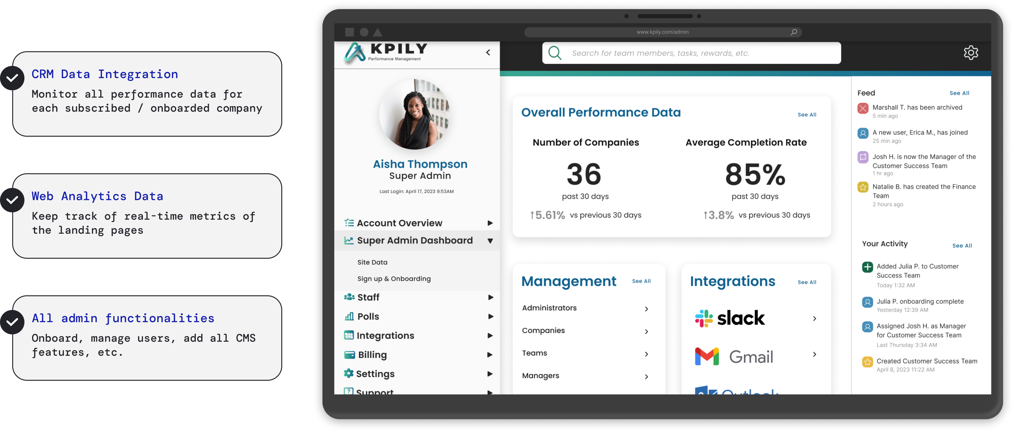
Track real-time performance of onboarded companies & landing pages
This is a industry design project that I worked on for Valourline Technology with two peer designers.
By conducting rapid research and utilizing the current design system, I designed a high-fidelity mockup of the dashboard by collaborating with my teammates.
Research insights
Users need a holistic & flexible dashboard to track business performance
As KPILY was still in development during our project, I gathered insights into potential internal user needs by interviewing internal stakeholders like product managers to understand expected use cases.
Additionally, I conducted literature research on Statista to explore user preferences in the Enterprise Performance Management market. Based on the research findings, I identified the following key user needs:

Requirements
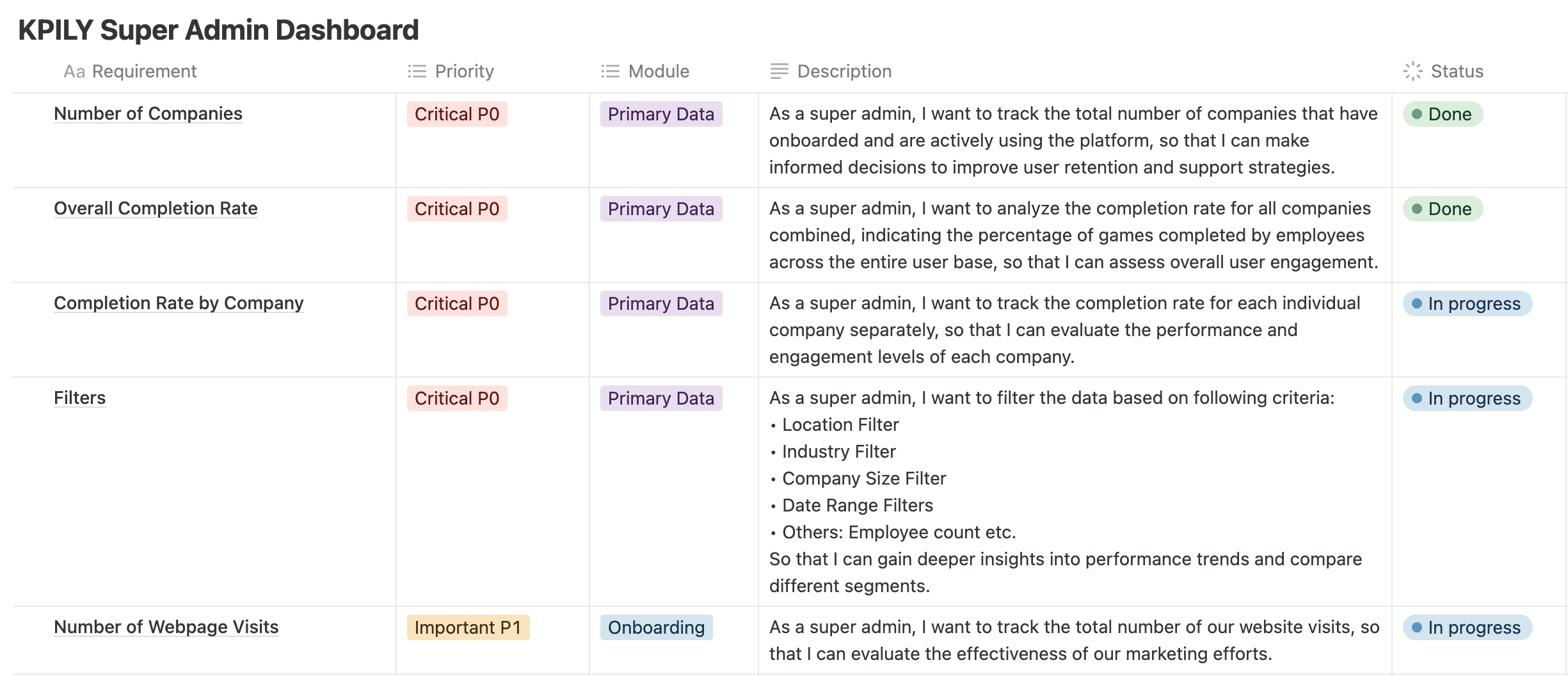
Prioritized the metrics
To ensure the quality of our designs, we had to determine which data would be primary and prioritized. This allowed us to prioritize the list of requirements and design the MVP within our limited timeline.
Recognizing this, I condensed the requirements into a new PRD and received our client's approval for production.
References
Understand the data visualization patterns
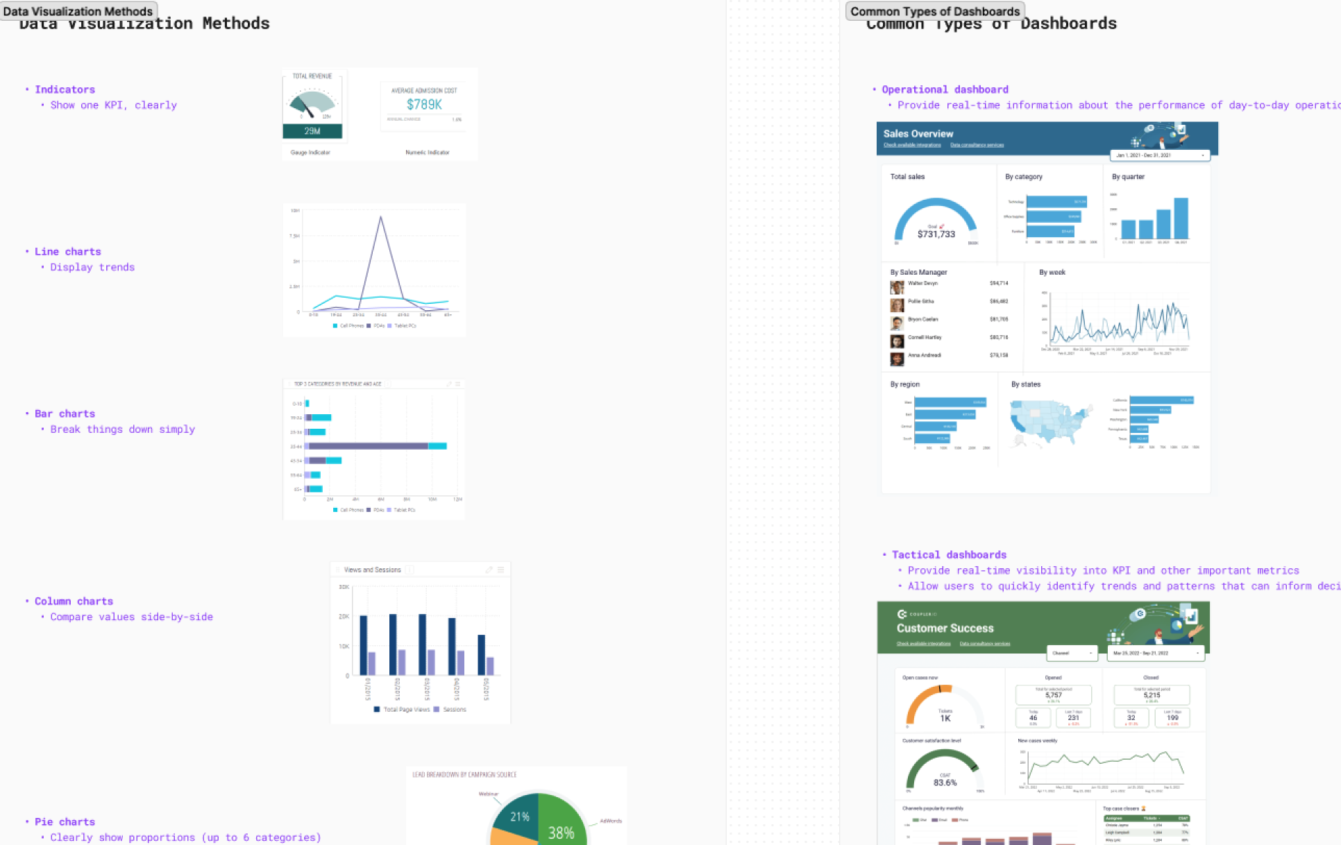
To gain a deeper understanding of how to present data more intuitively, I created a FigJam report that consolidates my references on the most common data visualizations and SaaS dashboard best practices.
Refer to industry standard
Given KPILY's complex information, selecting appropriate graph types for different data is crucial for quick user comprehension.
We found that indicators, line charts, tables, and pie charts are the most popular methods for data visualization in design.
Brainstorm on visualization methods
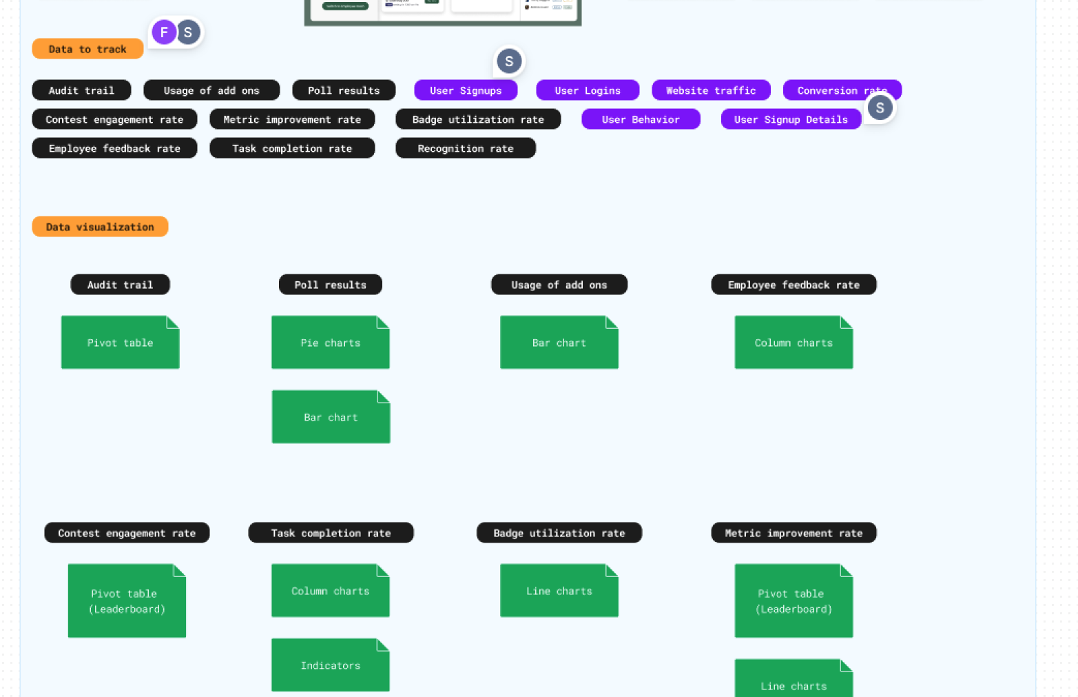
After exploring various visualization methods and data types, I facilitated brainstorming sessions to discover diverse visualization options with my teammates to enhance visual appeal and clarity.
Information architecture
Define navigation & hierarchy
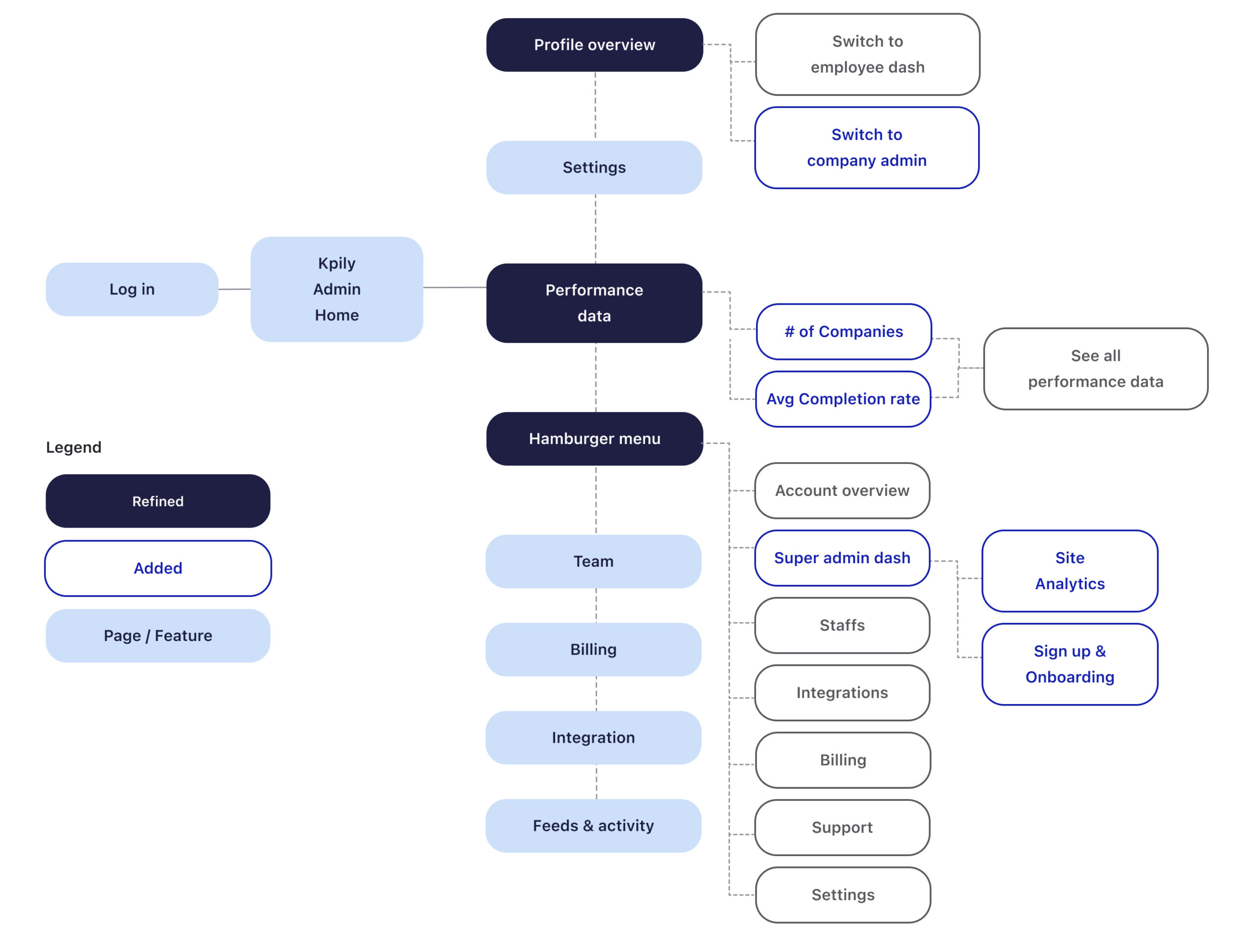
After identifying key data types, we focused on clear information presentation across modules. I refined the super admin dashboard's information architecture and presented it to stakeholders. Using the updated IA and feedback, I revised the sidebar menu and headers. This streamlines navigation, allowing super admins to easily access various data types through subcategories, simplifying the information structure.
User flows
Streamline the paths to data
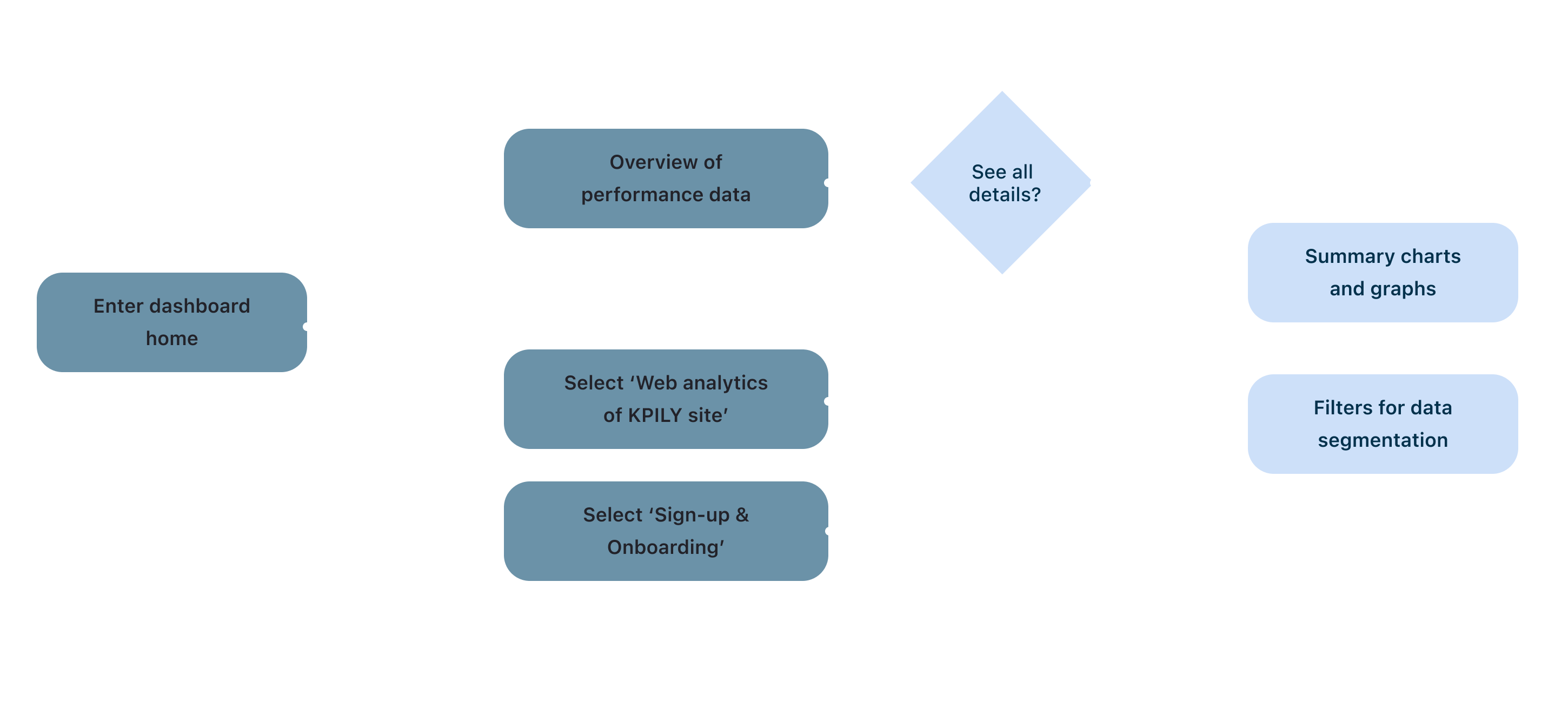
To identify the key tasks and actions for the super admin on the dashboard, we mapped out the user flow for navigation. This process helped us prioritize essential data visualizations, ensuring the dashboard focuses on the admin's most critical needs.
Design exploration
Determine the visual hierarchy
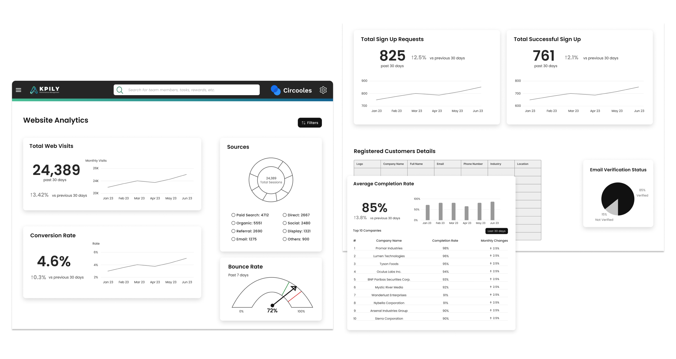
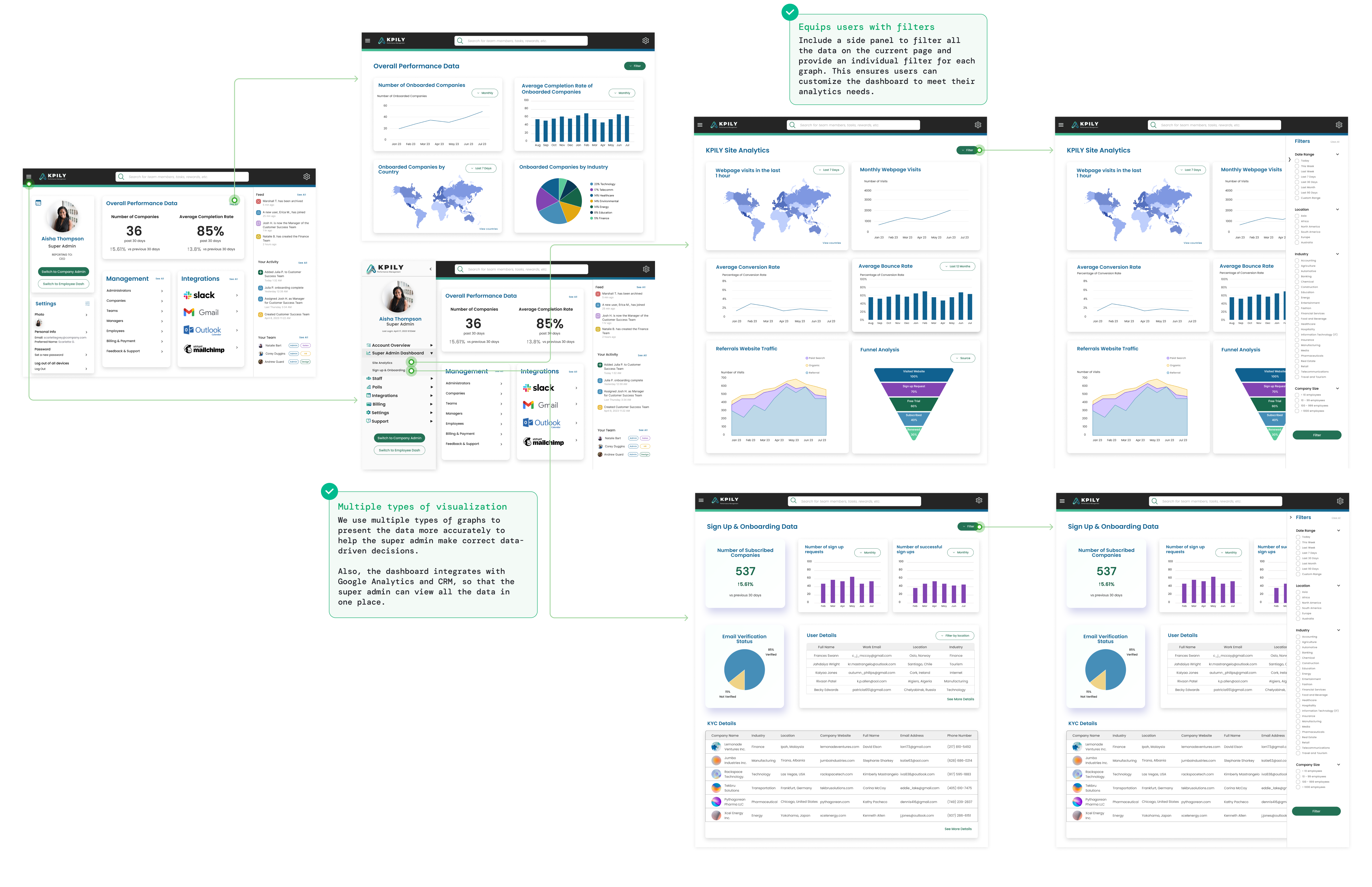
To give an overview of our initial ideas, I created wireframes to gather quick feedback from our client on the overall layout and structure of the dashboard. Since different sizes of graphs affect the layout of the dashboard, wireframing was particularly helpful because we were able to determine the visual proportion and hierarchy of each view, and balance the content of the dashboard.
Iteration
Adjust the layout & content of data
Our client agreed that using tables to present customer personal information was appropriate. However, she expressed a preference for cleaner and simpler line charts.
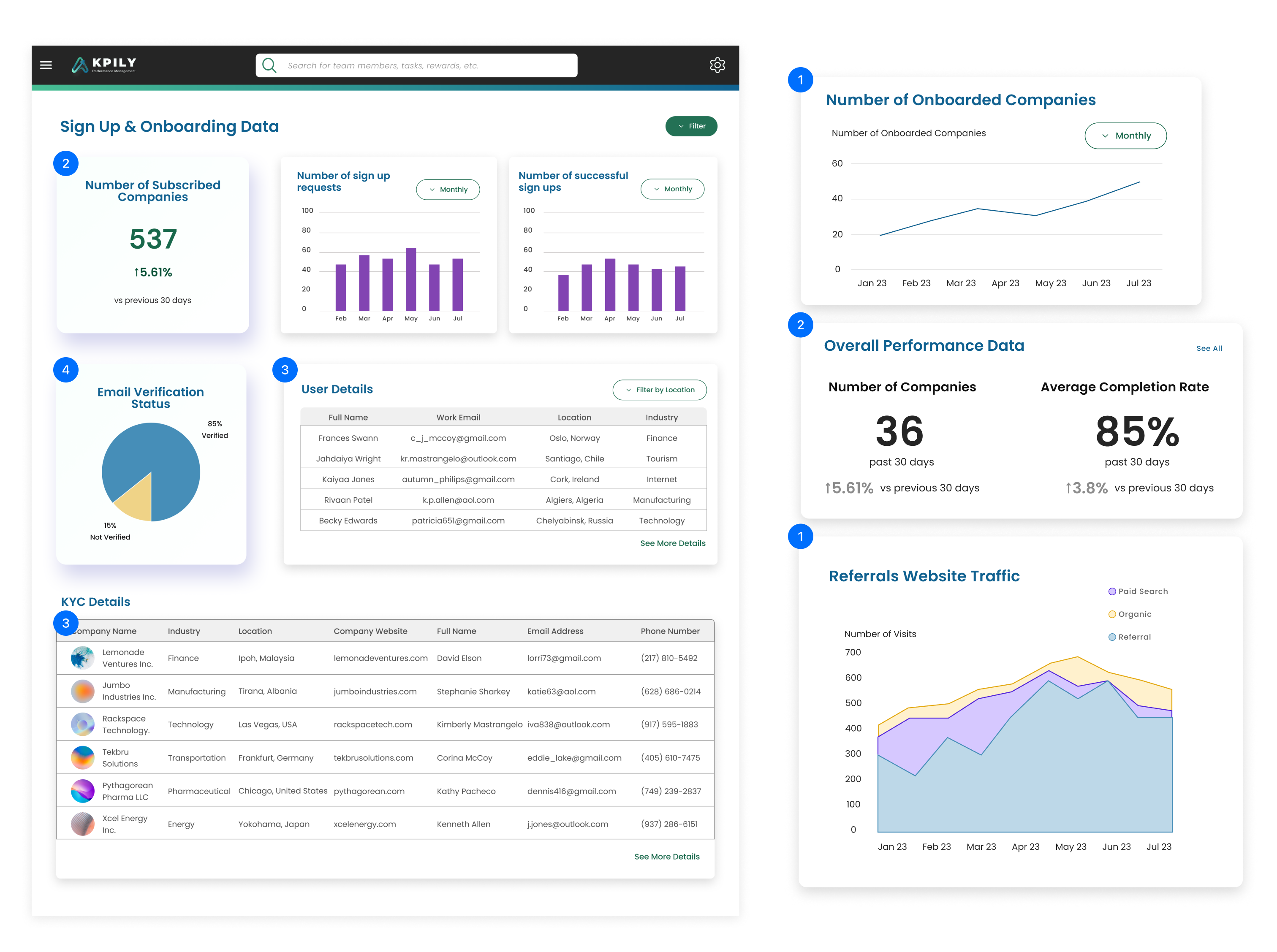
Considering our client's feedback and previous research findings, I made the following design decisions for our high-fidelity mockups, focusing on visualization methods and layout:
01.
Use line charts exclusively to display trends in website traffic and onboarded companies, rather than combining indicators and line charts
02.
Use indicators to highlight the key metrics that the super admin cares about most
03.
Refine the table to display essential customer information and active users' login details.
04.
Utilize pie charts to illustrate the distribution of users' email verification statuses
Final design
Enable users track different data quicly
To help the super admin analyze the data more quickly, we adopted a common 2-column layout used in the industry. We also display the key metrics prioritized previously in the top right corner to catch their attention.
Validation
Users suffered from data overload
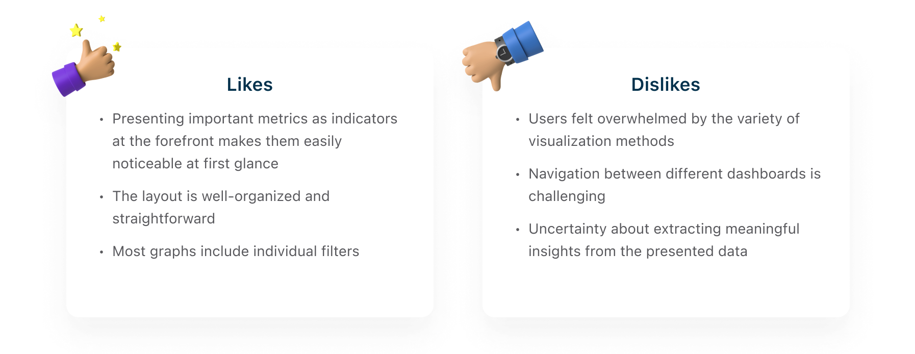
We conducted a quick internal usability test with 5 KPILY employees. All participants found the dashboards straightforward and clear.
However, 60% felt overwhelmed by the variety of graphs, unsure where to focus their attention when first landing on the dashboard page.
Test Results
80%
51s
3.95
60%
Task success rate
Avg. completion time
User satisfaction score (out of 5)
Raised issues of navigation & graphs variety
Next steps & takeaways
Improve navigation paths
Based on the feedback from testing, we recommended that our client prioritize design efforts to improve navigation between different dashboards. This would enhance the discoverability of these critical dashboards.
Provide benchmarks to compare
The current dashboard lacks metrics for industry or company benchmarks, which could help users compare their performance. To address these issues, we recommend adding tooltips or indicators like average values or internal goals on graphs of conversion and bounce rates, making it easier for users to understand their performance compared to industry or company standards.
Present actionable suggestions
Sometimes, users may not notice significant spikes or drops, which could indicate that something unusual occurred. To alert users to drastic changes in trends or numbers, it is better to provide additional insights alongside the data. This will help users make more informed and data-driven decisions.