OrcaLearn Web App
Streamlining an engaging quiz experience to rescue endangered orcas from a 70% decline
TL; DR
1. Streamlined the quiz completion flow for OrcaLearn to enhance user engagement and retention
2.Increased users’ understanding and satisfaction by 42% by creating a more intuitive and accessible learning experience for identifying SRKW calls.
3. Integrated design thinking methodologies for improved collaboration, resulting in a user-friendly educational platform that motivates continued learning.
Overview
What is Orcasound?
Founded in 2017, Orcasound uses open-source software and hydrophones (underwater microphones) to live-stream ocean sounds, connecting your headphones to the sea. Orcasound is dedicated to protecting endangered orcas, which has decreased by at least 70% due to noise pollution.
Product goal
To help users correctly identify SRKW calls, Orcasound stakeholders have requested the design of OrcaLearn, an online educational platform.
OrcaLearn is designed to educate users about the ocean and its inhabitants, particularly focusing on orcas.
Team
1 PM, 3 Researchers, 6 Designers
Role
UX Designer
Timeline
4 months, Oct 2023 - Feb 2024
Platform
Mobile Web App
Our challenge is to enhance the quiz feature
Usability testing in May 2023 showed 50% of participants missed the Quiz feature. The UX team set a new project goal: Revise the Quiz feature for first-time users.
I was responsible to design the quiz completion flow to help first-time users easily engage with and understand the quiz results, fixing identified usability issues.
User groups
Who are we designing for?
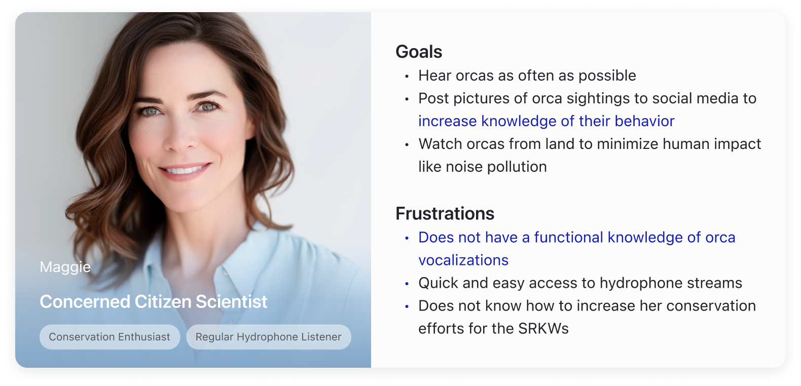
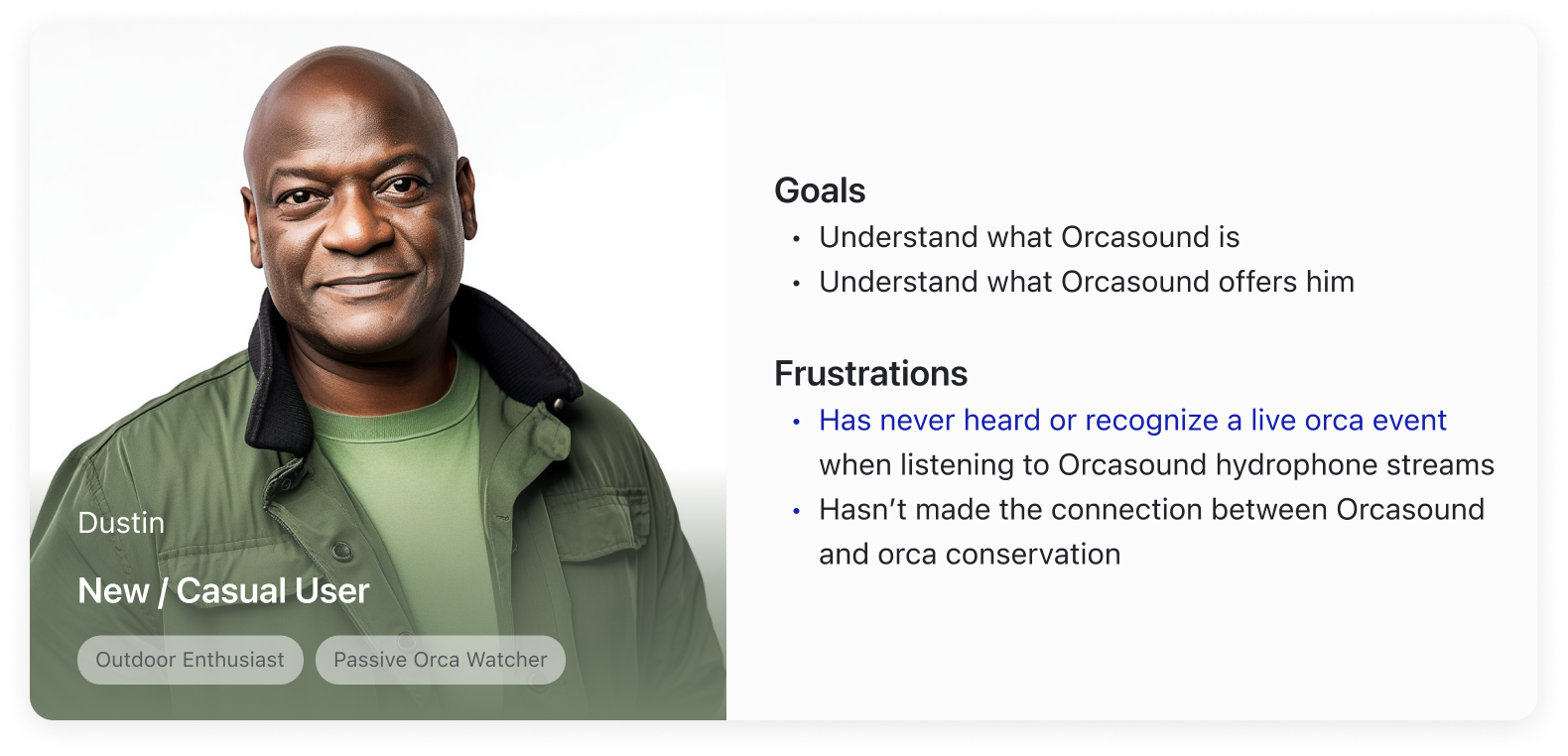
Orcasound has specific user personas such as Concerned Citizen Scientists and Casual users.
Therefore, before starting the design, I reviewed and reorganized the previous UX research findings for the team to understand our user groups better and meet their needs.
User problems
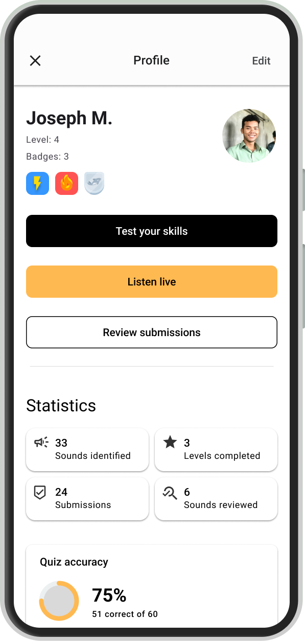
The old completion flow doesn't provide a clear summary
To better understand why participants didn't notice the quiz feature, I analyzed the previous flow and found the following problems:
❌ No overall percentage / accuracy in overview of quiz performance
❌ Wordings of CTA buttons are not specific & clear
Design exploration
Refine the visual hierarchy
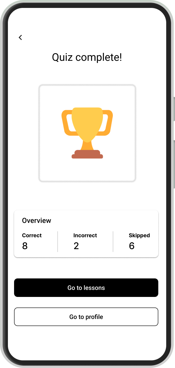
My design goal was to provide a clear and quick summary of each quiz result to keep first-time users on track and evaluate their performance, so that users won't get confused or lost amidst the loads of new information, prioritizing encouragement and CTAs to continue learning.
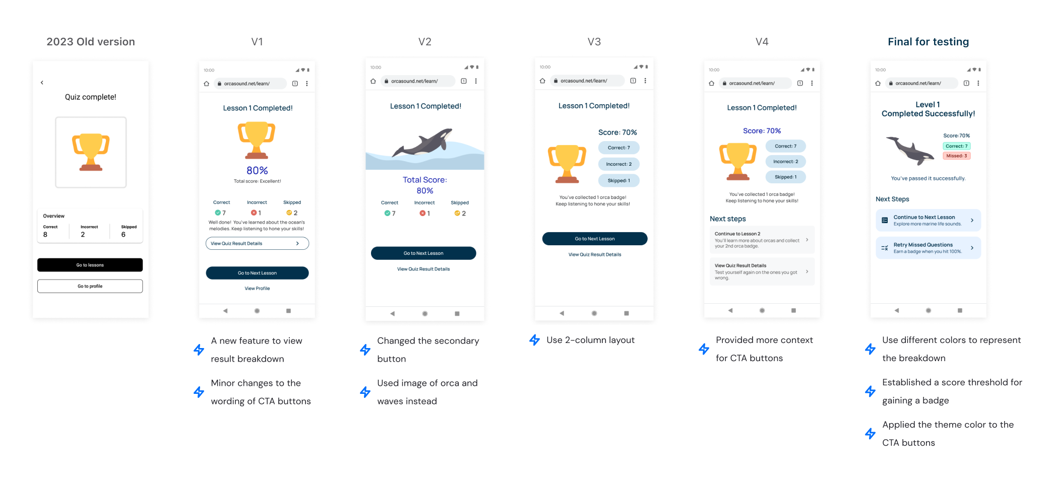
Overcome the common use case where users make n+ mistakes
01 - Why
In addition to providing concise and motivating quiz results, I believe it's crucial for users to correct their mistakes promptly. This will help users to fully grasp the knowledge from the current quiz level before moving on to the next.
02 - How
While designing for this feature, my fellow designer’s solution seemed clear and straightforward, it doesn’t solve one of the most common edge cases that our primary users might encounter.
To overcome this edge case, I came up with a more flexible layout to enable users to retry any question, increasing their willingness to learn from them.
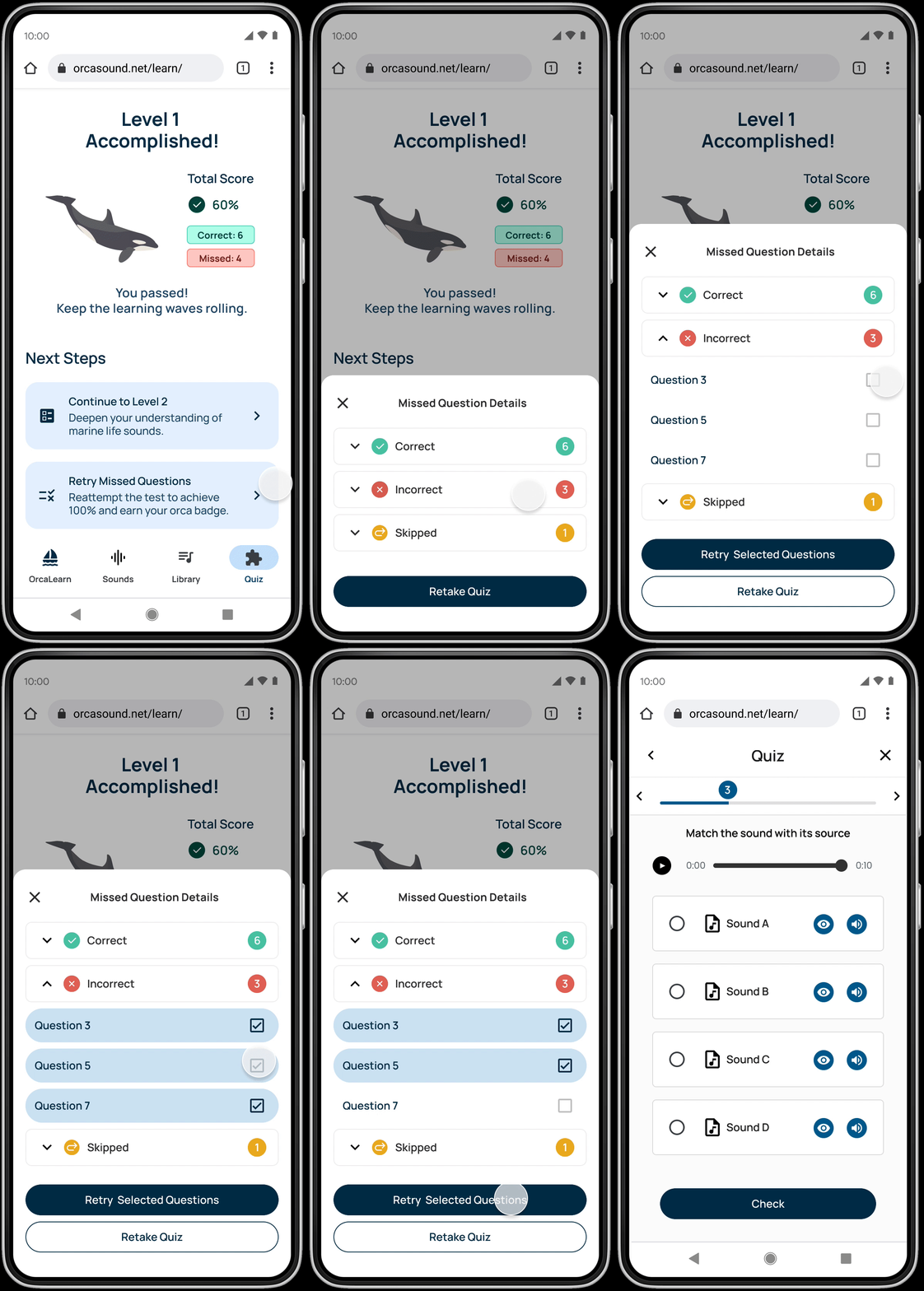
My solution > Multi-select
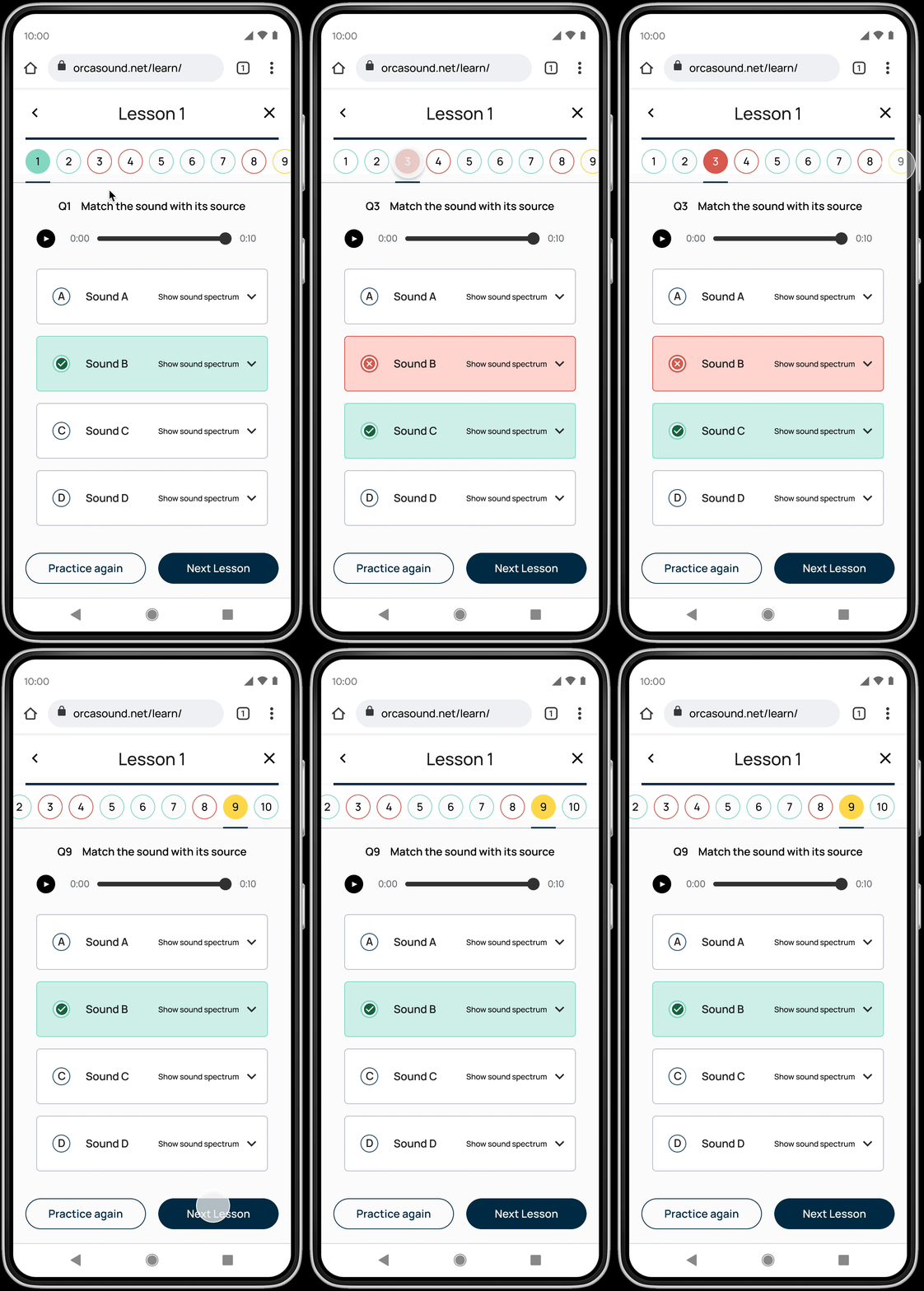
My colleague's solution
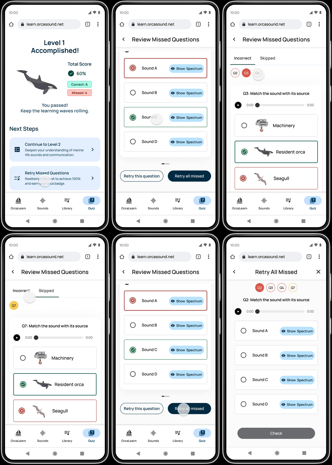
Final prototype for testing
03 - Outcome
To overcome the budget challenge for concept testing two different solutions above, I collaborated with my fellow designer to combine the advantages of two designs and create a new design and prototype to enhance this feature.
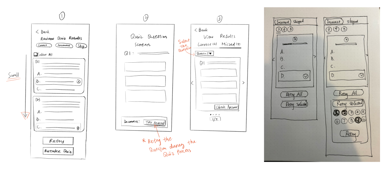
Our sketching during brainstorm sessions
Validation
Understand users' confusion
I collaborated with our UX research team to conduct a usability study on the quiz completion flow to find out how users perceive the information on the quiz result screen and whether the retry feature helps them learn from their mistakes.

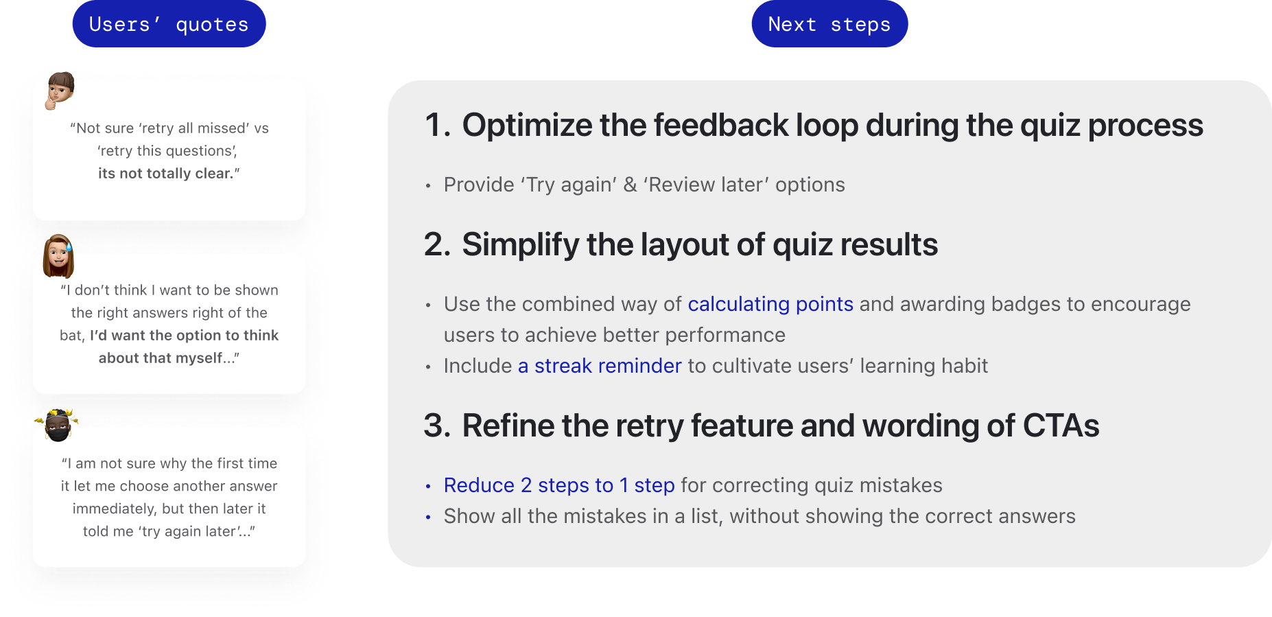
We received feedback that 13.3% of participants prefer not to see the answer when retrying.
They also want retries for incorrect answers to make the quiz more enjoyable and emphasized the importance of having the option to retry during the quiz itself, not later as it is currently.
Additionally, the inconsistent microcopy confused participants when navigating this feature. Based on the user feedback and discussion with the team, I purposed the following design iteration for next release.
Iteration
Enable users to handle mistakes more flexibly
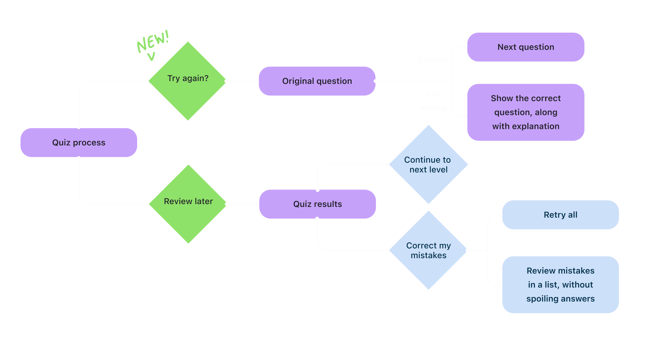
To ensure the quiz process is smoother, I proposed adding 'Try Again' and 'Review Later' options to the fellow designer responsible for the quiz question section. She agreed, so we decided to move forward with this solution in our next iteration.
Below is the new user flow I created for when users don't get the questions right during the quiz process:
Final design
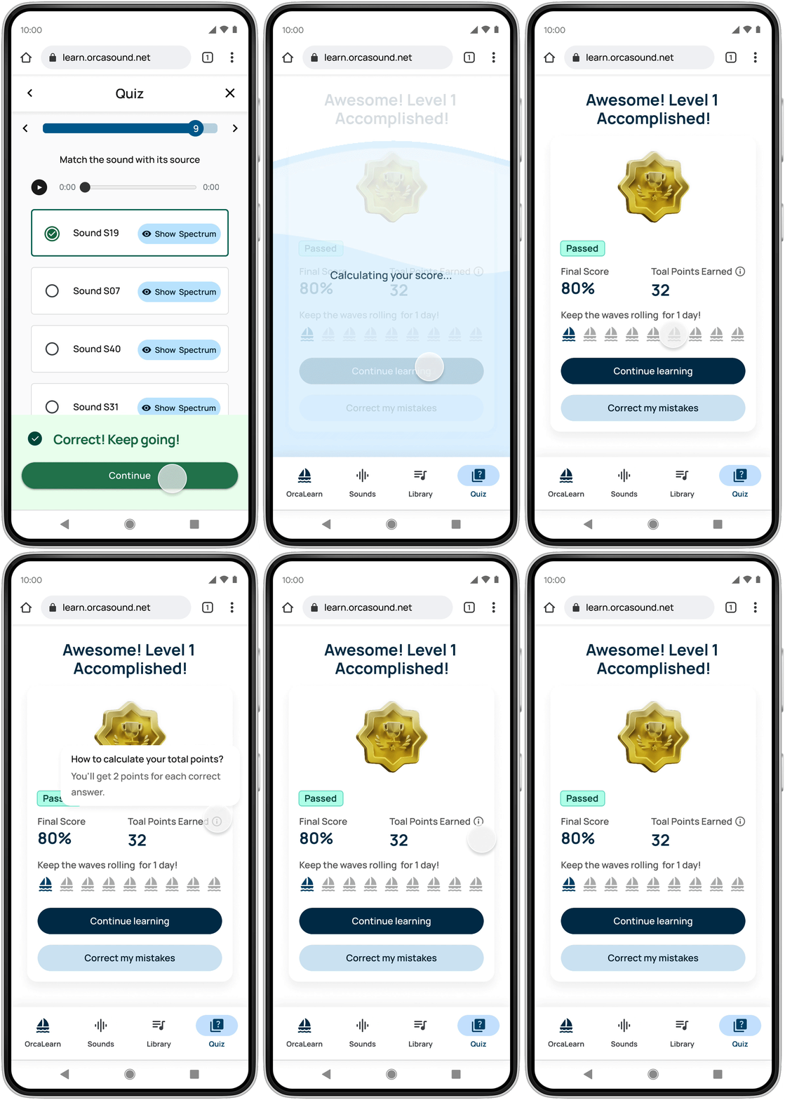
Design reusable card to display the quiz result
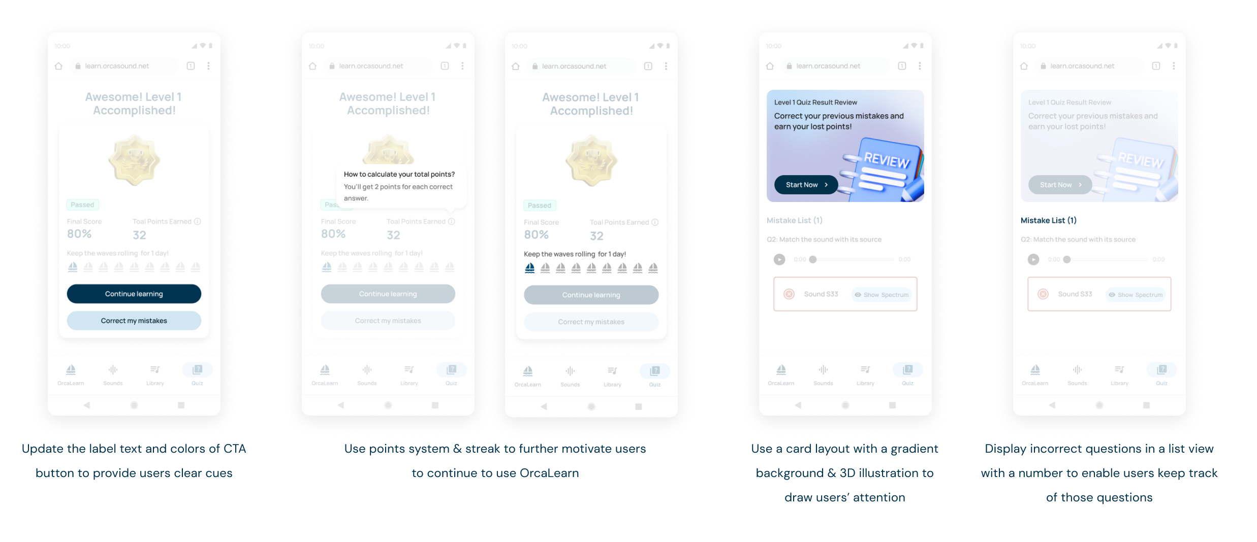
- Use the primary theme color as the text color to emphasize the important metrics for users
- Add a tooltip to tell first-time users how many points they will earn when they answer questions correctly
- Add a loading state between finishing the final questions and the result to provide users a smoother transition
Refine the review screen to save users' clicks
- Create a 3D illustration of a notebook named 'Review' to highlight the user goal of this flow. When users see this card, they can immediately understand its purpose.
- Apply a gradient to make the card stand out more and match the 3D illustration's vibe
- Polish the label text of the CTA to be more straightforward
- The mistake list shows users only the wrong answers instead of spoiling the correct ones
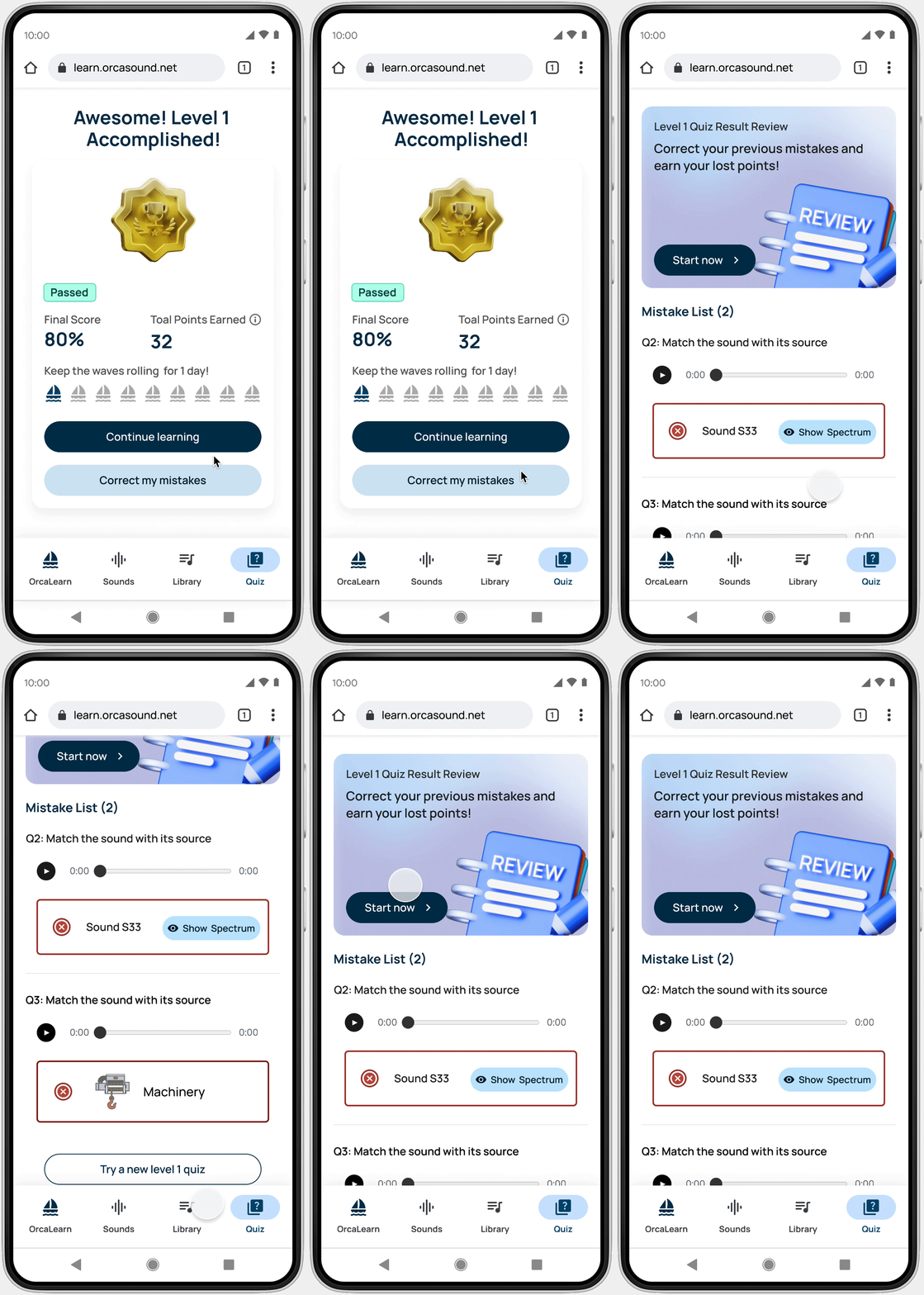
More design details on iteration
Shows users different states after correcting mistakes
The CTA, the illustration and description below was being designed specifically for each use case.
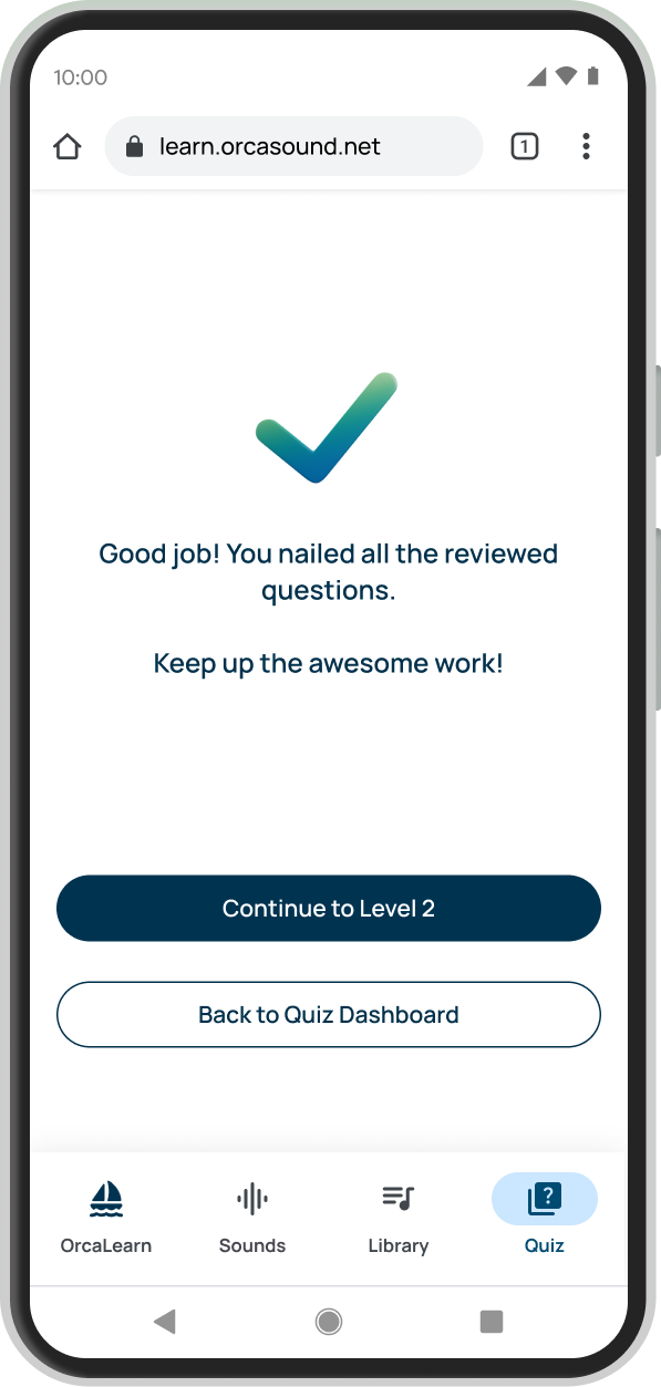
After users correct all mistakes
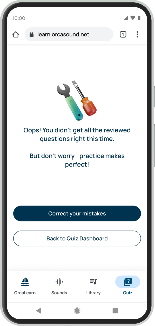
After users haven't got all the questions correct
Key takeaways
The art of connecting the dots
While working with a large group of designers, maintaining consistency and coherence across individual contributions is crucial. Just as the human body requires each organ to function harmoniously, a product's various elements must logically connect to create a seamless UX. Consistent communication within the team ensures alignment and everyone is informed about design updates, which facilitates cohesive progress.
Improved misaligned mental models
We should recognize and cater to differences in user preferences, like delaying the revelation of correct answers for incorrectly answered questions. Consistently, we should prioritize UX writing to ensure clear and distinct button labels, which will improve user comprehension and engagement with the overall quiz flow.
67%
CTR on next level of quiz
8s
Time on correcting mistakes
42%
User statisfaction increased