TrashMob Mobile
Boosted user satisfaction by 30% through optimized event discovery
TL; DR
1. Own the redesign process for a mobile app dedicated to organizing and promoting trash clean-up events, aiming to enhance user satisfaction and event participation rates.
2. Collaborate with PM and engineers to draft & prioritize user stories by refining the user journey and 5+ workflows.
3.Built and maintained a small but scalable design system to decrease design to dev handoff time by 30%.
Overview
Background
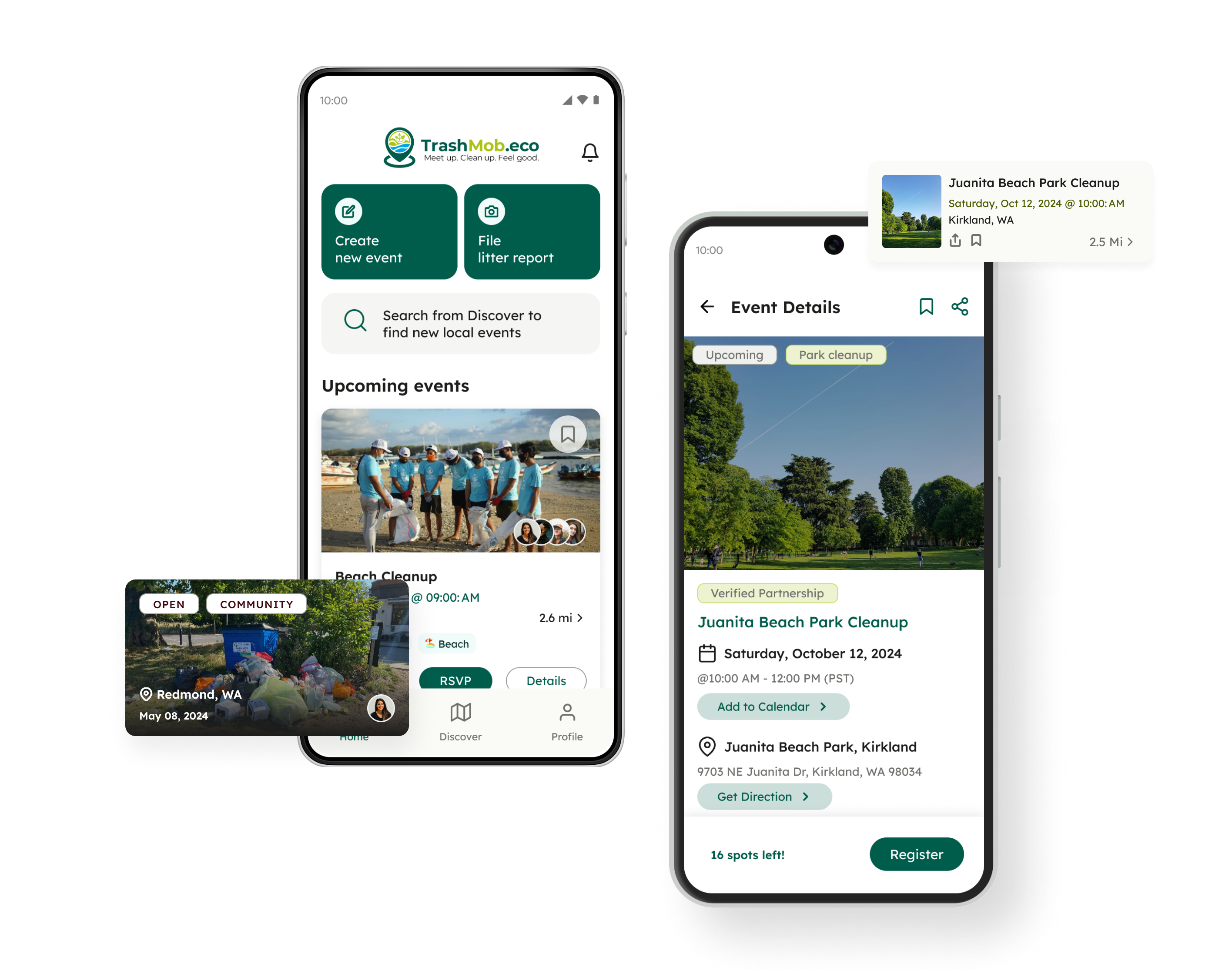
TrashMob is a nonprofit organization that aims to mobilize eco-minded individuals to clean up our planet. It initiated a redesign of its mobile application aimed at helping users organize and join cleanup events with minimal clicks and uncomplicated forms.
Project goal
The goal was to improve overall user engagement and streamline the event registration process.
Team
1 PM, 3 Developers, 2 Designers
Role
Lead UX Designer
Timeline
8 months, Oct 2023 - Jun 2024
Platform
Android, iOS
Eco-minded users don't have a streamlined platform to easily plan and join clean-up events
According to Keep America Beautiful, the largest community improvement organization in the U.S, over 9500 clean-up events were hosted in 2023, with 300,000 volunteers helping out.
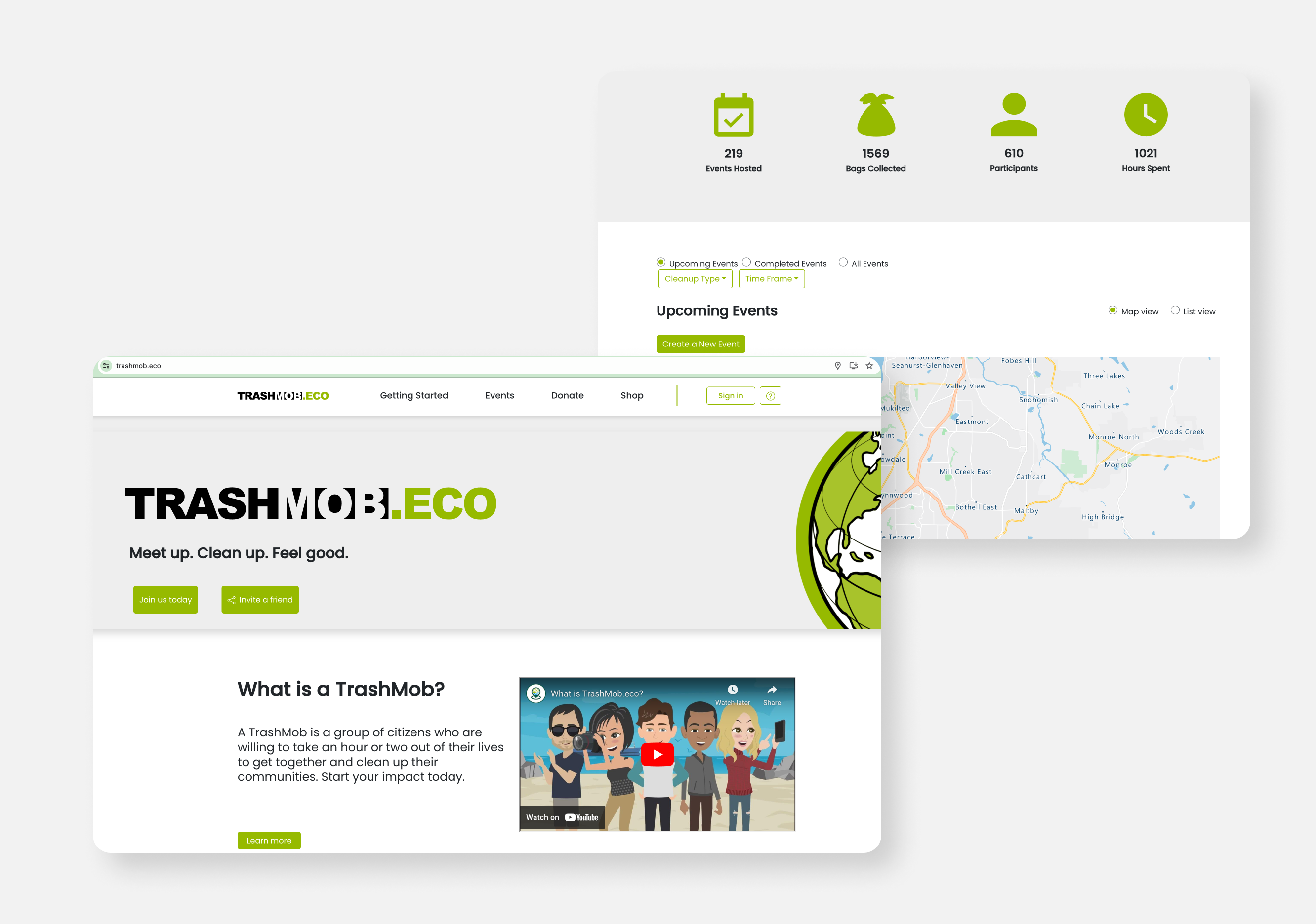
However, these volunteers currently must use desktop websites or certain social media apps to participate in these events. When they are using these software, they encounter the following problems:

Redesigning volunteers' clean-up experience
To kick off this project, I conducted a 1:1 interview with the founder, arranged an alignment session with the team and reviewed the current TrashMob website to better understand its purpose.
To prepare for my design efforts, I set up a couple of design goals to achieve during the redesign process.
01.
Enhance the visual hierarchy and clarity of the information architecture to assist users to discover, join & start an event
02.
Revamp the outdated and inconsistent visual style to a modern and cohesive mobile design
03.
Improve the workflow between design and development to maintain consistency and increase productivity during product development
Research
Understand major pain points
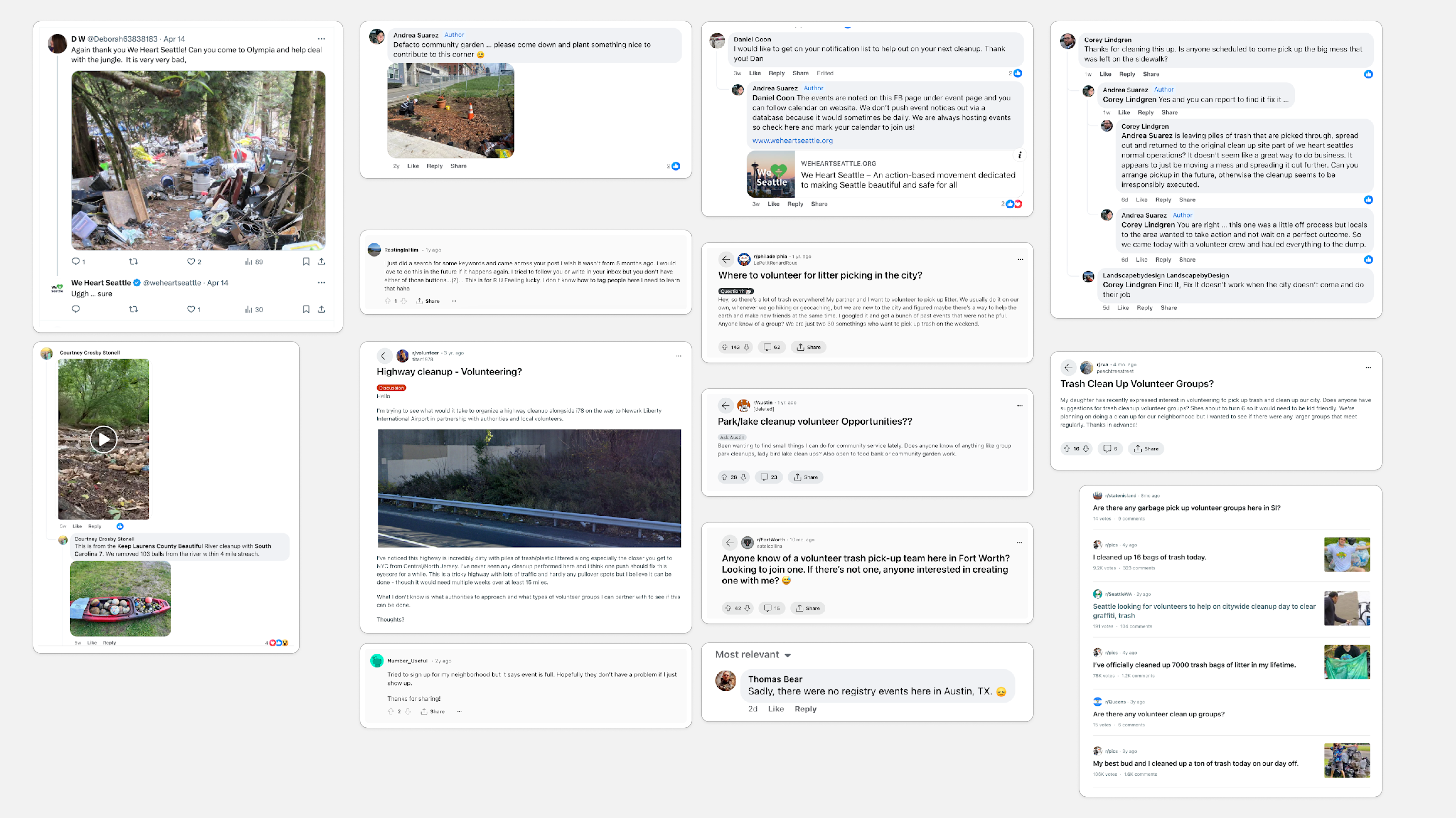
First of all, to fill the gaps left by the previous design team, I conducted secondary online research. I reviewed pages of feedback and comments on social media platforms like Facebook to understand our potential users' experiences and goals better.
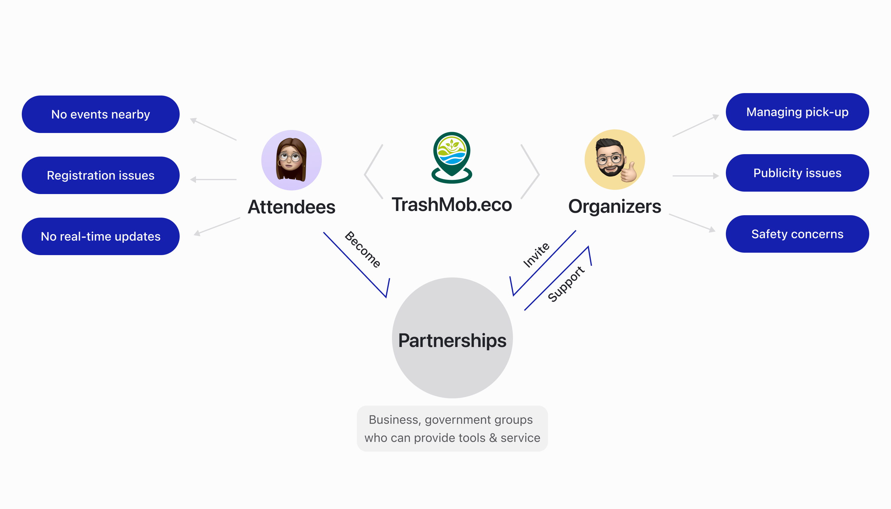
After analyzing these users' feedback, I've discovered that our main user groups have the following issues:
Competitive analysis
Existing event planning apps offer limited functionality
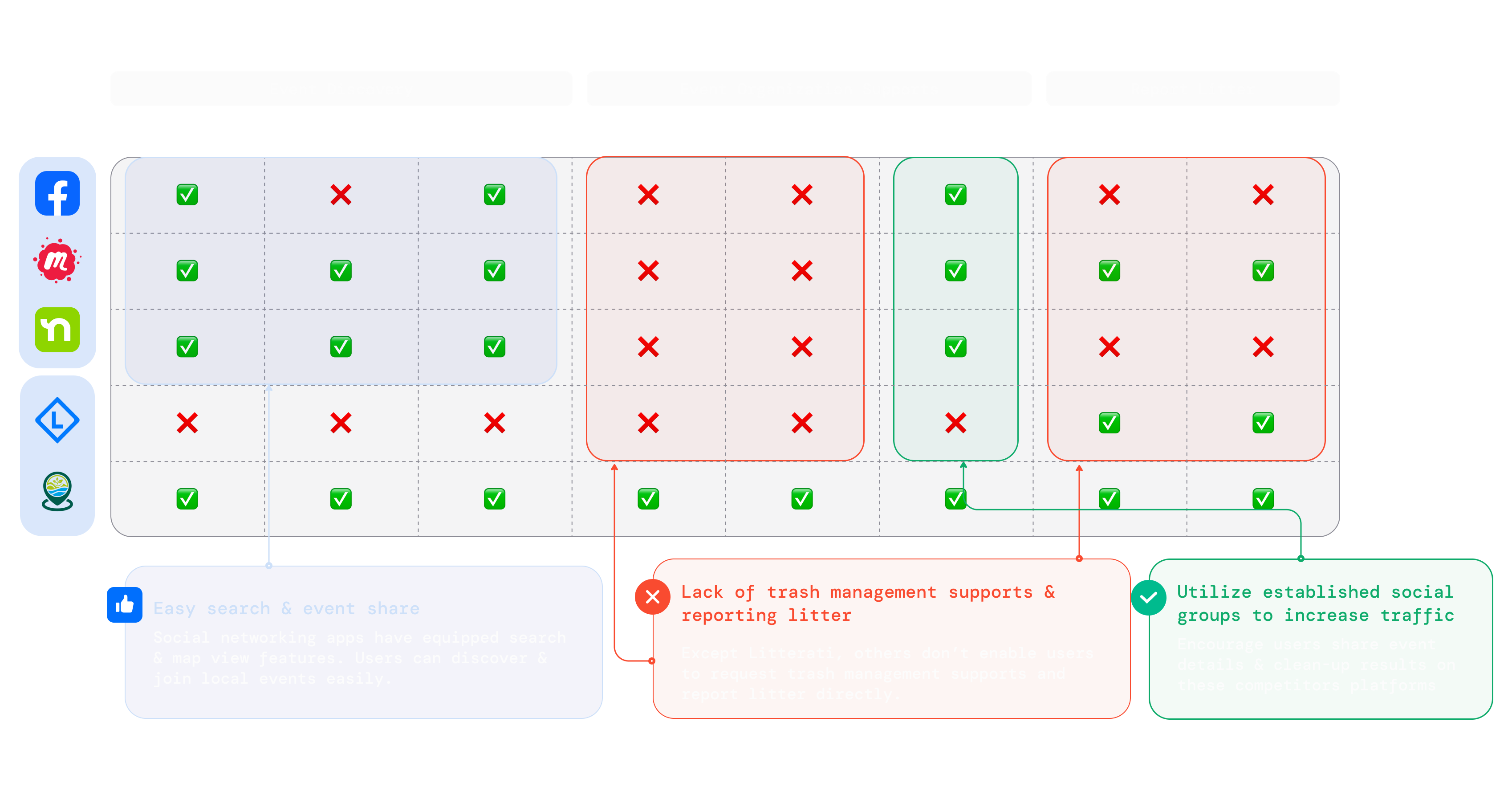
I also conducted a competitive analysis to understand design patterns and industry standards. While our competitors offered easy search and event-sharing features, they lacked trash management support and litter reporting features for our user groups.
We definitely saw an opportunity to partner with them to meet more user needs by utilizing established social groups.
Heuristics evaluation
Identified issues for improving mobile usability
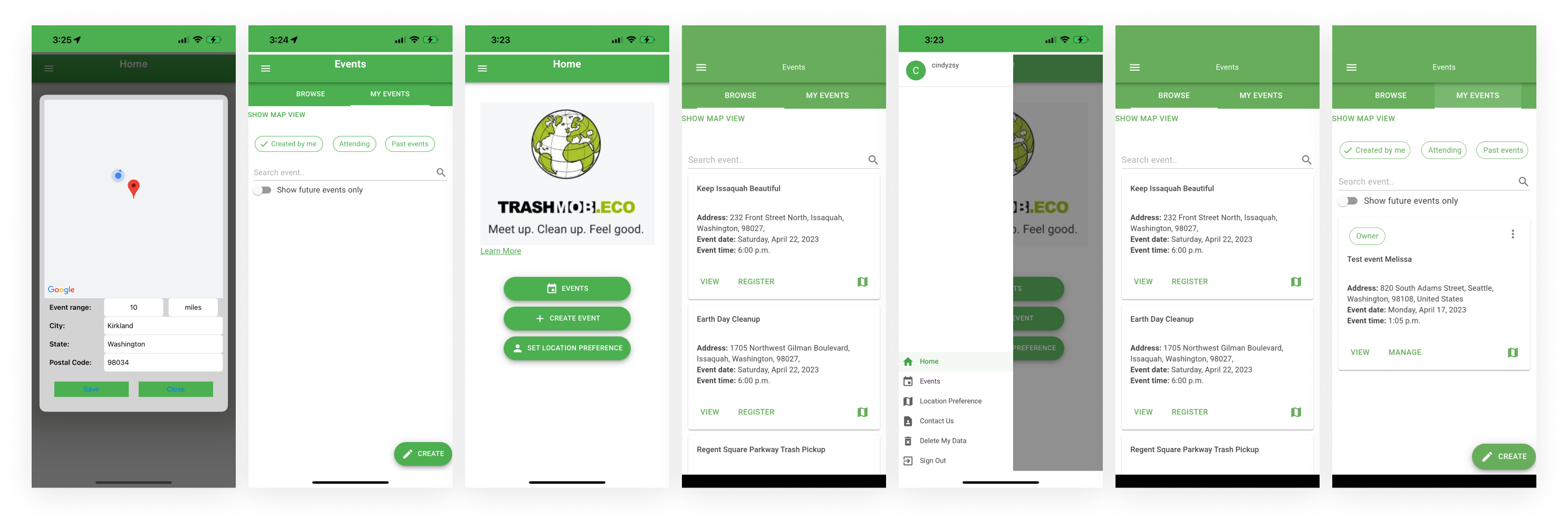
I also conducted a heuristics evaluation of the current version and found the following critical UX problems:
🤔 Unclear information architecture; ❌ Missing visual hierarchy
User journey map
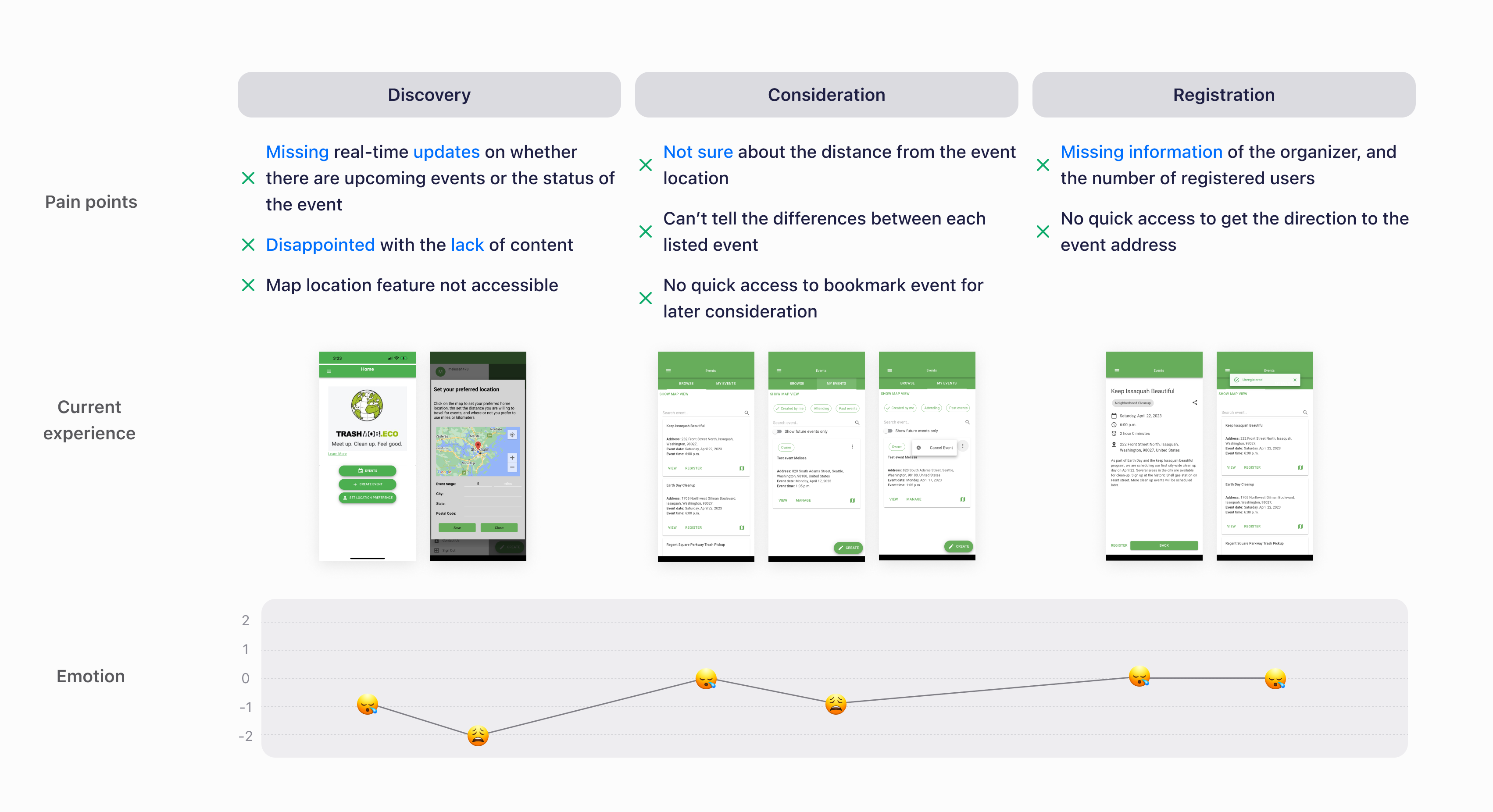
Identify key stages that frustrated attendees
In this MVP, we focused on discovery, consideration, and registration stages to address some major pain points like missing real-time updates, event location distances, and organizer information details.
Information architecture
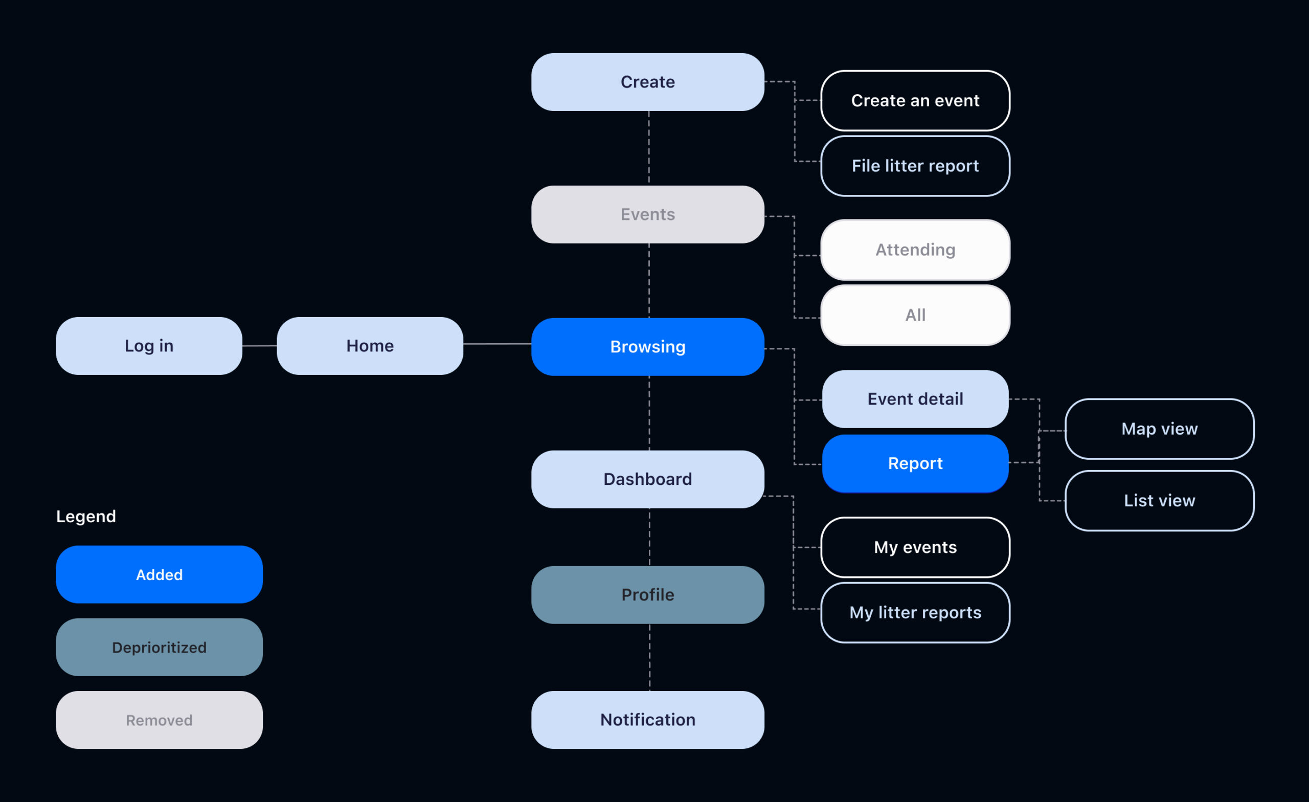
Provide users clear guidance to discover upcoming events
After prioritization meeting with the PM, I decided to refine the information architecture.
We added and prioritized the browsing flow and removed incomplete flow like events to improve the overall event discovery experience.
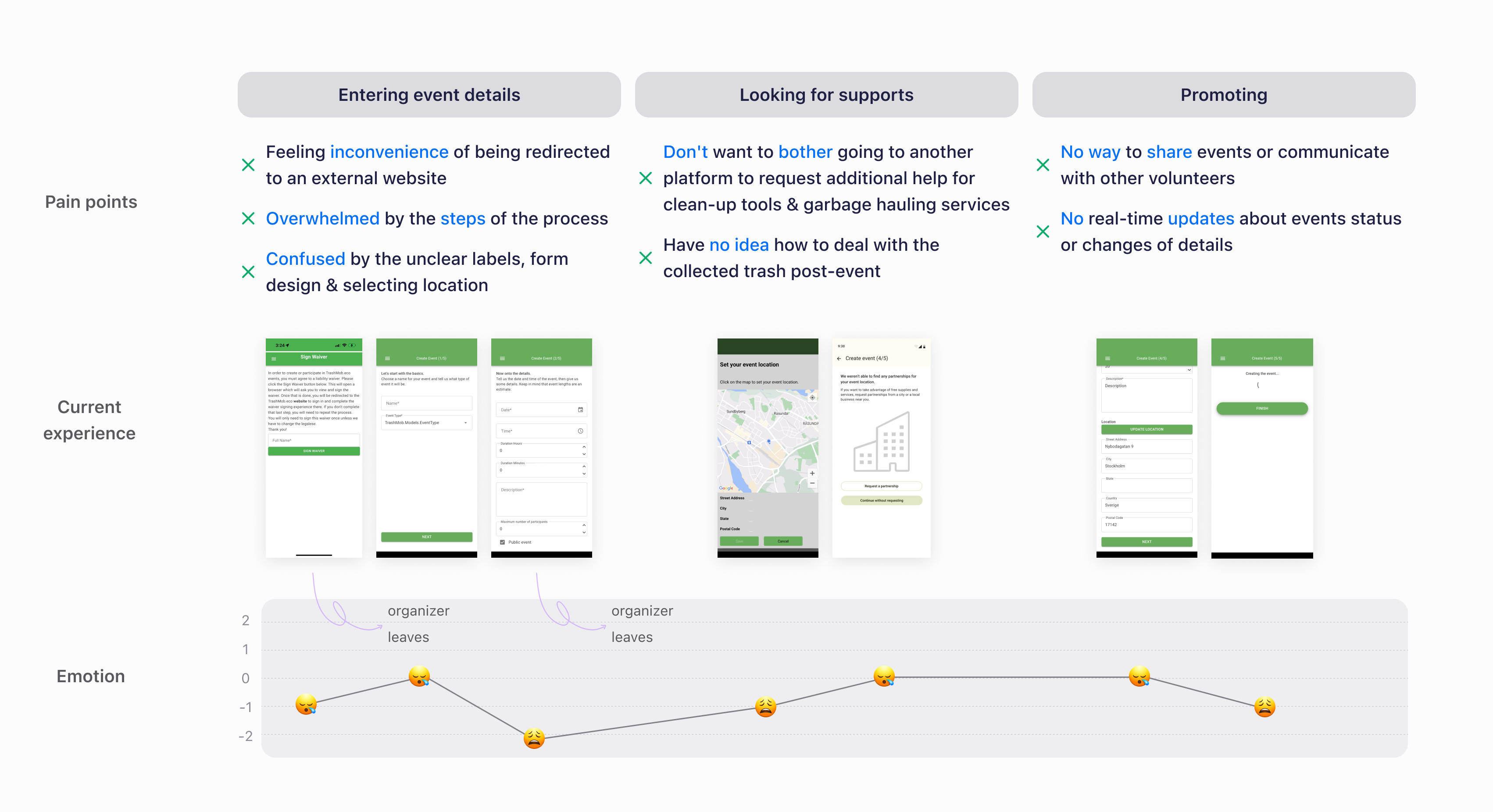
User journey map
Identify where organizers most often dropped off
Again I identified pain points in the organizer's user journey, such as inconvenience in using external websites, being overwhelmed by multiple steps during organizing an event in the app, and no way to share events.
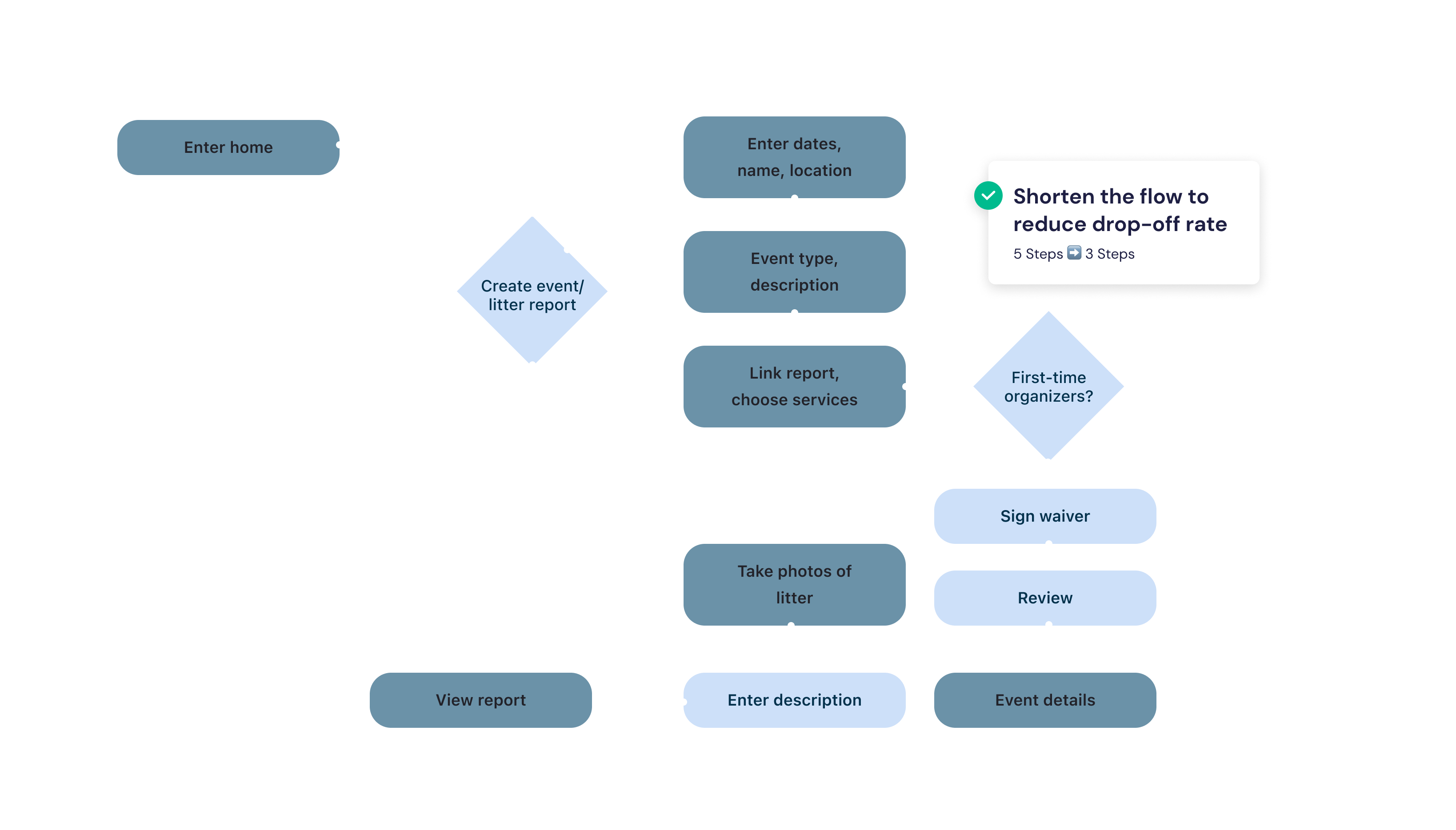
User flow
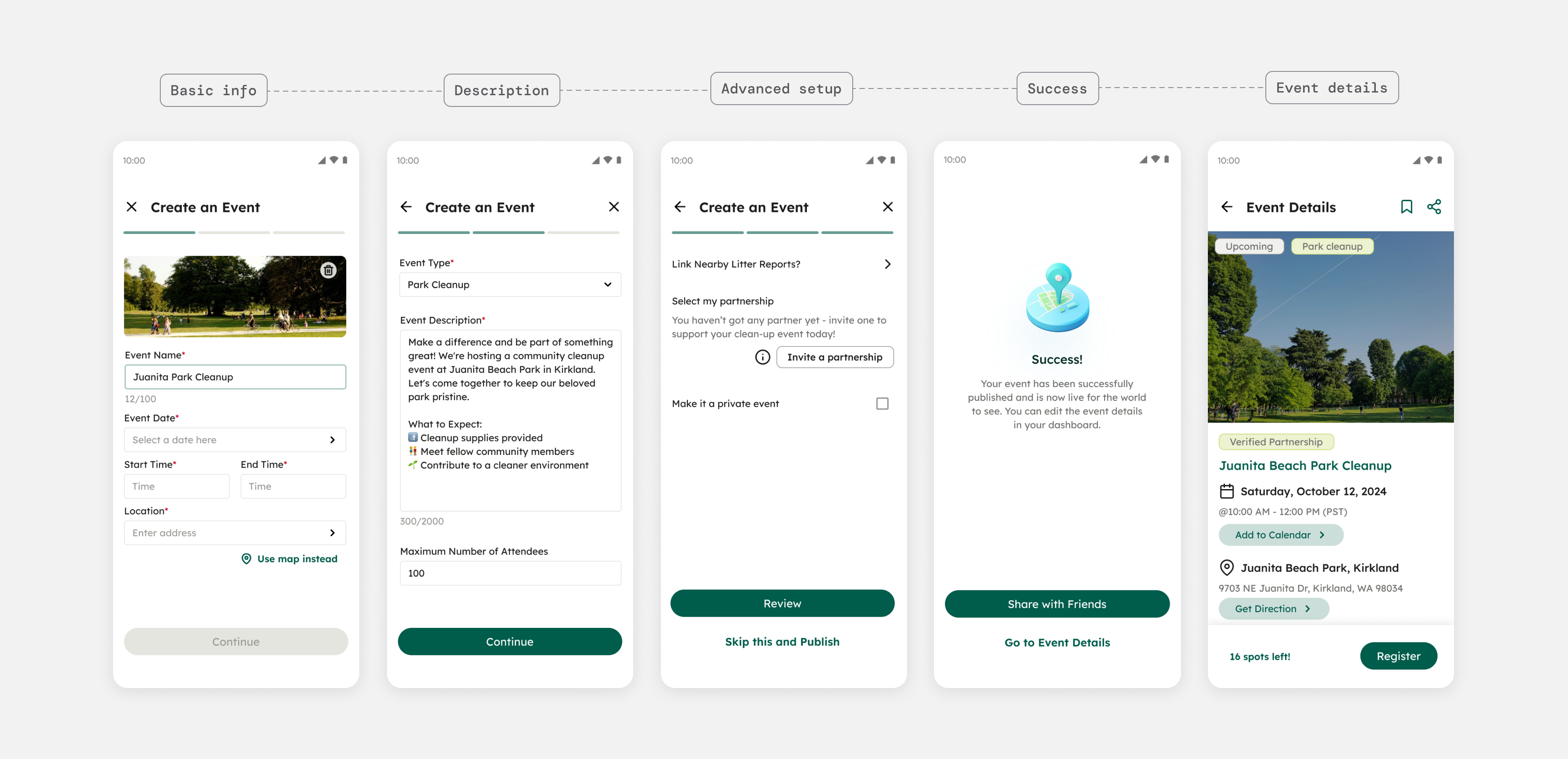
Streamlined the event creation process by reducing to 3 steps
Design decisions
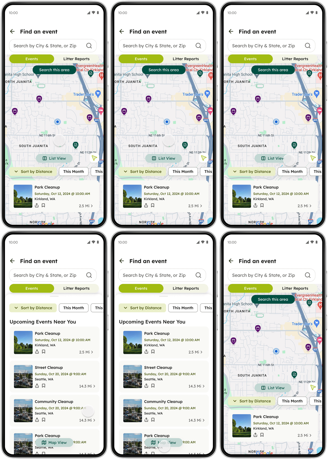
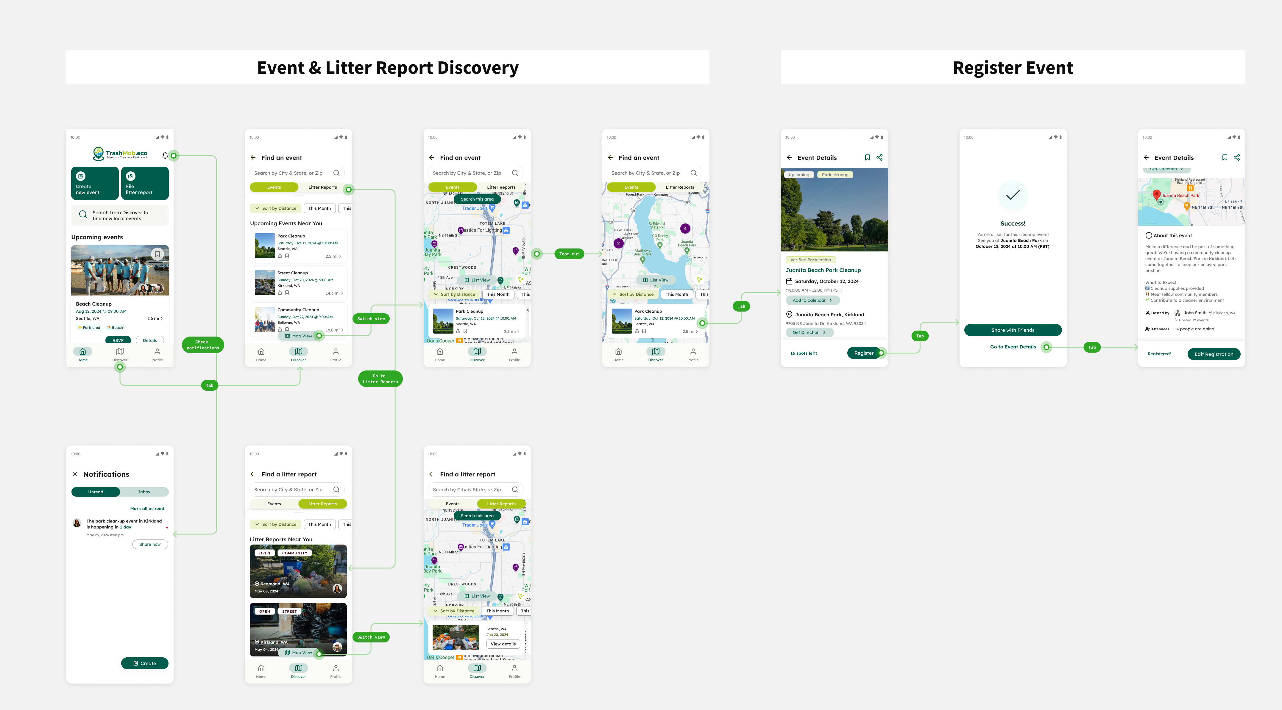
Introduced map / list views
Different views provide attendees flexibility to use the app find events;
Users will clearly visualize the specific direction and distance from their current location. The details for each nearby event appear more organized in a list view.
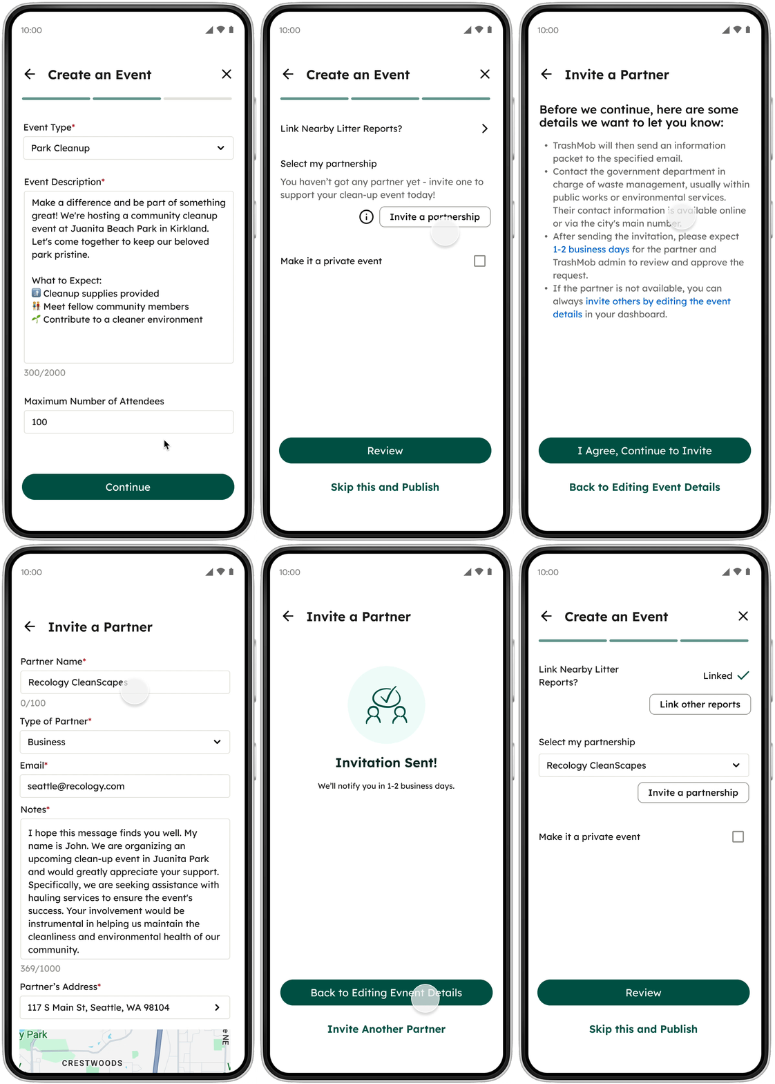
Guide organizers on connecting with partners for supports
Incorporated a feature to speed up the process of connecting with potential partners;
This reduce the time and effort organizers need to spend communicating with partners via third-party websites and apps.
Validation
Evaluate two major flows
After completing the high-fidelity design, I conducted 9 remote usability testings with a clickable prototype. During the testing, participants found event discovery & registration flows more straightforward.
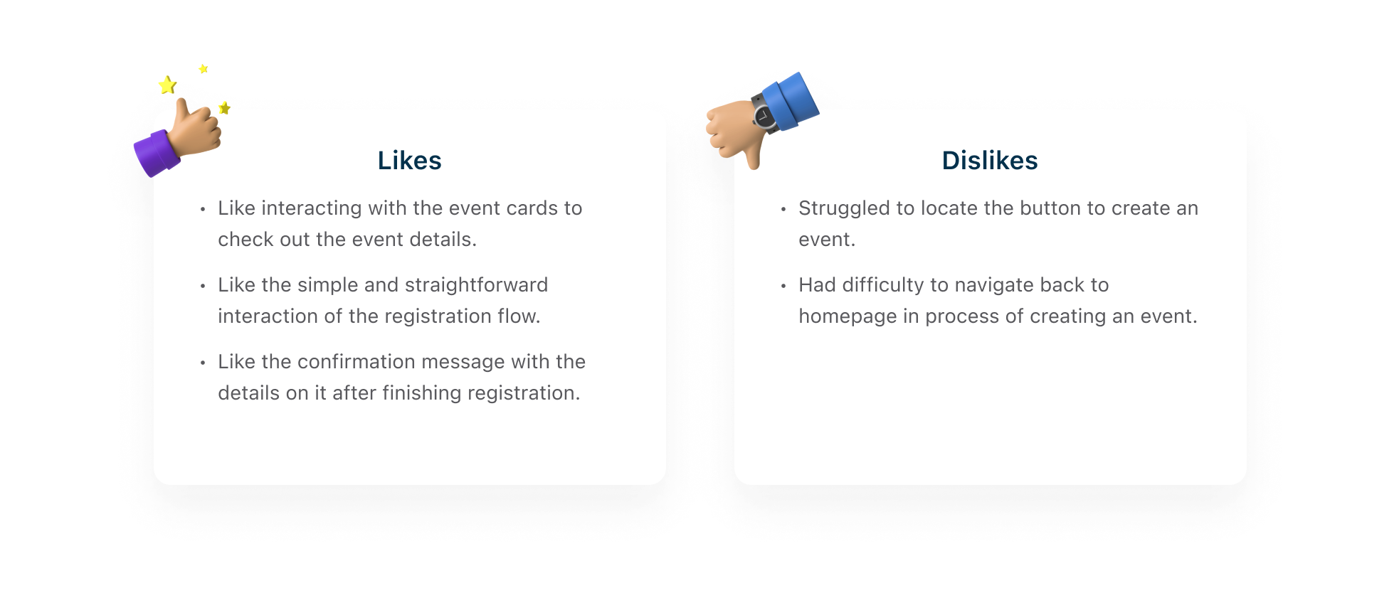

Iteration
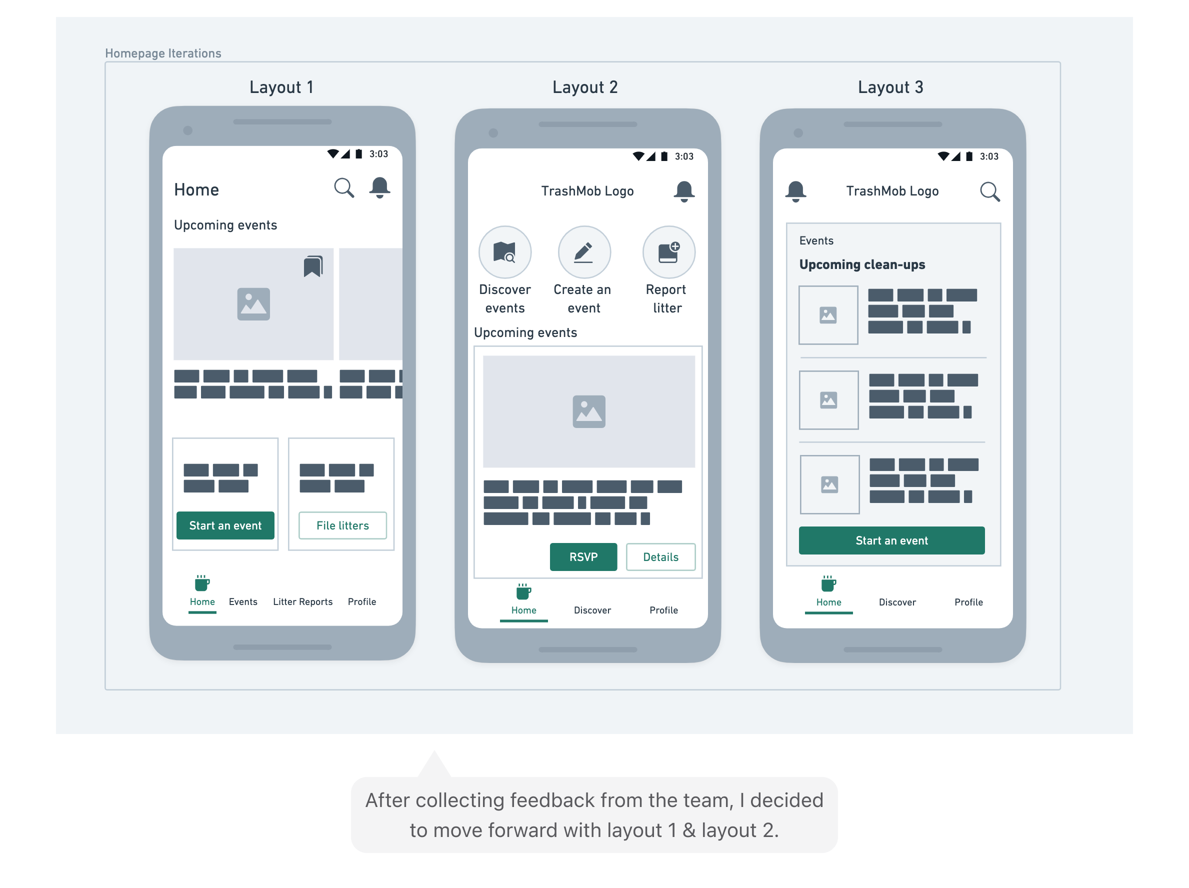
Enhance the home navigation
Following an analysis of the key challenges faced by participants in 1st round of usability testing, I brainstormed, created wireframes rapidly, and implemented the following iterations.
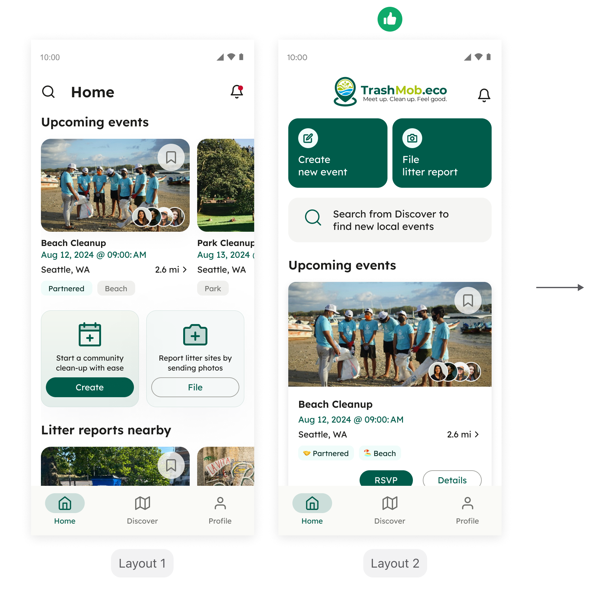
After presenting the high-fidelity designs for both options 1 and 2 to the team, we decided to proceed with the 2nd layout. It offers users a clearer visual hierarchy and allows attendees to register for a new event more quickly.
01.
Introduced bottom navigation tabs for more flexible app navigation
02.
Deprioritized and removed the summary dashboard from the homepage
03.
Prioritized the upcoming events section and designed a reusable component to display event information or litter reports
Final design
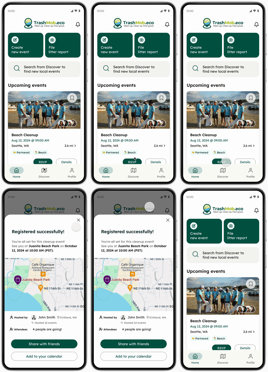
Save attendees' time to find upcoming events
To enhance users' event discovery experience, the map and event result layout need to be more straightforward and accessible. This will simplify users' access to details of nearby events.
Reduce information barriers for organizers to creat events
Other key features
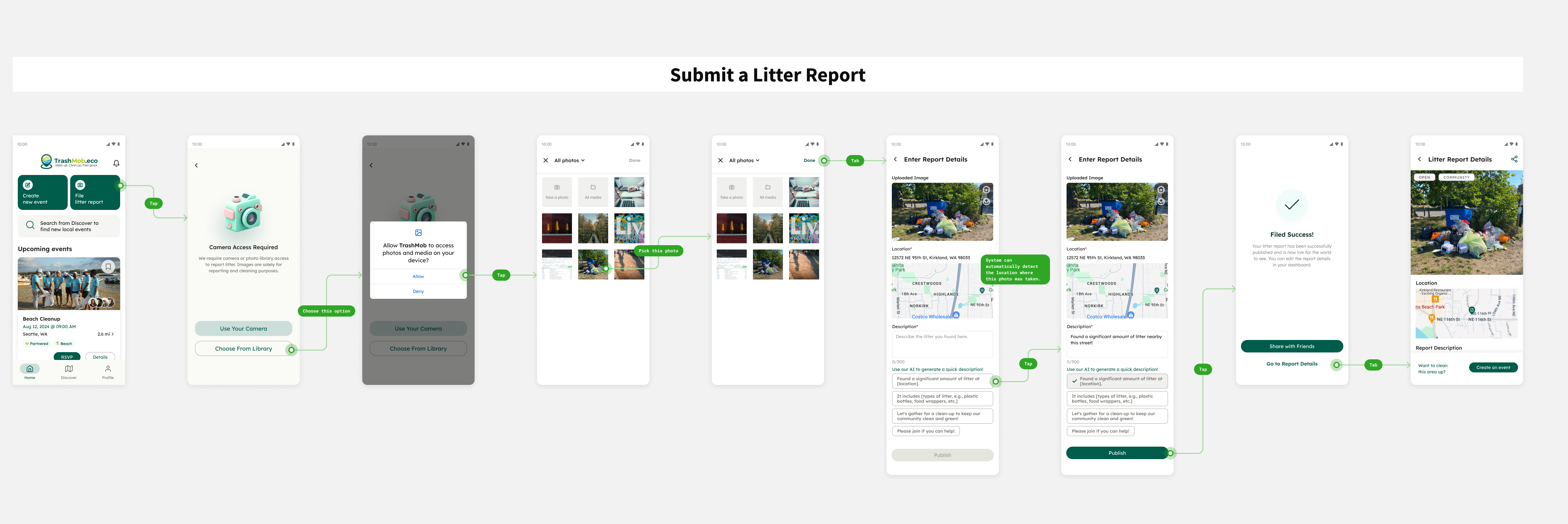
Report litters nearby easily
To better assist users who have found litter, we have also developed a key flow for reporting litter. This process enables other users to organize clean-up events for the reported litter sites.
Visual
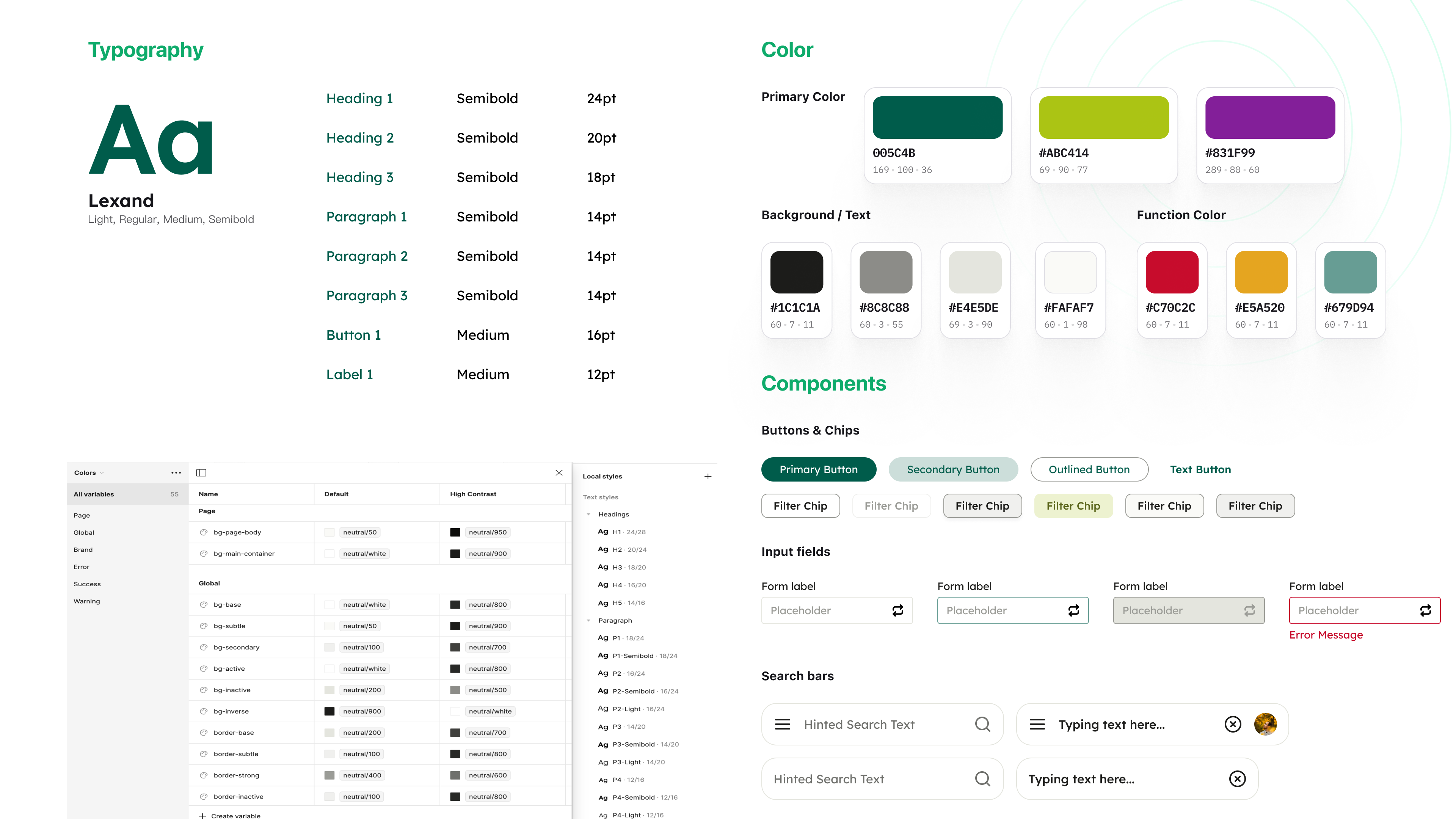
Established a design system to ensure consistency of UI
Despite the challenge of finding a starting point for redesigning the app and standardizing the overall UI design, I overcame this by collaborating with a graphic designer.
By establishing a small but scalable design system, we improved user perceptions of the TrashMob mobile app.
Design handoffs
Faster UI implementation
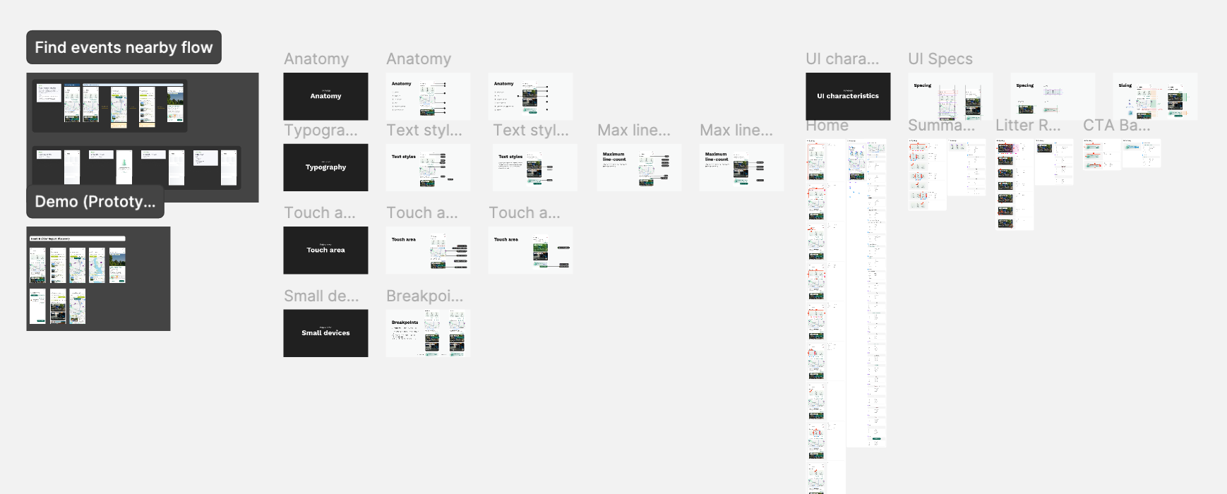
I prepared handoff documents for engineers, highlighting key screens and context. I organized flows, built prototypes for demos, and collaborated closely to ensure their understanding throughout implementation.
Reflection
Rapidly prototyping to validate
I should not only involve developers in the early design process for feedback on technical feasibility, but I should also have conducted iterative usability tests with potential users as we finalized the first version. This ongoing user feedback allows us to make informed adjustments from the user's standpoint and refine the design.
Include more edge cases
Maintaining frequent and close communication with developers is crucial. It's also necessary to discuss edge cases with them to ensure the new feature can be launched as quickly as possible.
Next steps
Early PRD planning
Plan and prioritize user stories & design efforts with product managers and developers for the next MVP, envisioning the creation of a gamified mobile platform to encourage more users to help clean up the planet together more often.
100%
Users completed event registration
2 mins
Time to finish creating events
4.8
Avg level of easiness (out of 5)